Learn how to work with and design PowerPoint charts using Microsoft Office. You can learn quick tips to make awesome charts and tweak the current Chart setttings in PowerPoint or download free chart templates for PowerPoint including histogram chart template for PowerPoint or other nice PPT charts created for different purposes.
Gantt charts are often used to depict project schedules and the state of an ongoing project in terms of the progress made regarding set milestones. We have singled out some professionally designed PowerPoint templates that you can use for depicting your Gantt charts as PowerPoint slides. The list of the best Gantt chart & project …
Quad charts are a highly effective tool for presenting complex information in a visually appealing and easily digestible format. These charts divide data into four distinct quadrants, allowing you to convey multiple ideas or datasets in a single slide. Used across various industries, from business and marketing to research and education, quad charts can help …
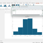
Using Excel and the free Analysis Toolpak add-in for Excel, you can create useful histograms for your spreadsheets, but also use the resulting image to copy and paste the Histogram in PowerPoint presentations. Here we will show you how to make histogram charts for PowerPoint using Excel. Here we will show you how to create …
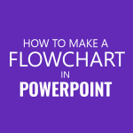
A flowchart is meant to display a task or process in a sequence. Such charts are often required for making business diagrams, models showing production processes and tasks. There are various methods by which you can create flow charts in PowerPoint, including with the help of SmartArt Graphics, shapes and readymade templates. What is a …
Before you start making a flowchart in PowerPoint, it is necessary to know the meaning of the various symbols that are used in it. Knowledge of these symbols is essential for presenting your chart according to the right mix of shapes. Below is an explanation for the meaning of different flowcharts symbols.
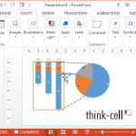
When making data driven charts in PowerPoint, the primary problem is to edit the charts in a way that they look professional enough, without ruining the layout. Moreover, some chart types are simply not available in PowerPoint. Think-cell is a Microsoft PowerPoint add-in that helps you create professional, brand-compliant presentations, enhances your slide layouts, and …
Constructing a flowchart isn’t easy. One should be aware of all the meanings of each flowchart symbol to correctly display a process, as even a single misrepresented symbol can change entire meaning of the process being depicted in the flowchart. This is why we brought you a detailed post about the meaning of each flowchart …
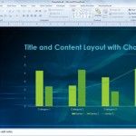
Selecting the appropriate chart is one of the most effective ways to convey data-driven insights in a presentation. PowerPoint provides a wide variety of built-in chart types, and with its integration with Microsoft Excel, you can either paste charts directly or link them to an Excel spreadsheet so that updates in the source file are …
With this creative design for PowerPoint presentations, you can now create scientific PowerPoint presentations or slideshows and other academic-related templates. This free Academic PPT template features an atom symbol, and the content slides have a dark blue translucent overlay for better readability of light-colored text. You can download this free template for widescreen PowerPoint presentations …
In this tutorial, we’ll be creating a flowchart using SmartArt in PowerPoint. These shapes are very stylized versions of normal shapes available in PowerPoint to make a collective of shapes for different purposes. If you refer to our prior tutorial on creating flowcharts, you’ll find the same procedures apply here. Before starting, have your data …