Download free charts and diagrams for PowerPoint presentations and learn how to make your own diagrams and presentation charts using PowerPoint. For example, you can learn to make sankey diagram in Microsoft PowerPoint for free or download PowerPoint diagrams pack for free using SmartArt and PPT shapes.
Charts can be an effective method of displaying data before an audience; as it can show a trend for large chunks of data in an easy to grasp visual representation. Moreover, dashboards with multiple sections of data can be another good method for making good use of scarce space on a PowerPoint slide. Fortunately, Slide …
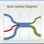
Sankey diagrams are a specific type of flow diagram that are widely used in thermodynamics and material flow management. In this kind of diagrams, the width of the arrows is shown proportionally to the flow quantity. You can use this kind of Sankey Diagrams as a visualization of energy, material or cost transfers between processes. …
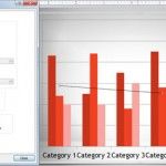
Charts can be handy in presentations where you need to show data. This is sometimes preferred against complex tables as a visualization tool because the audience can get a better view of what you want to show. However, the charts should be prepared according to your presentation to make them readable. PowerPoint charts are very …
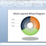
This article will explain how to design a simple but useful wheel diagram with multiple layers. You can use this kind of PowerPoint diagrams as a visualization tool for your presentation reports or dashboards, but also to combine the design with other similar visualizations like steering wheel. Let’s see how to make a layered wheel diagram …
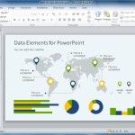
When you’re creating PowerPoint presentations, listing your ideas and data in every slide can make your slides look dull. It’s nice to break it up with images and visuals. And while pictures can paint many words, if you want to present comprehensive information, you have to have charts. Here is a tip on how to …
In PowerPoint you can download additional SmartArt content from Office.com but before you can access the resources you will need to change a setting in the Options page. Here we will show you how to add new Office.com SmartArt Graphics to PowerPoint. First, you need to configure your Trust Center options to allow PowerPoint download …
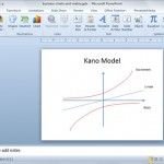
The Kano model is a very popular model named after Noriaki Kano. It is used for classifying customer preferences based on five categories. Sometimes you may need to prepare a a PowerPoint presentation showing the Kano model in the slide designs. In this article we will review how to draw a Kano model diagram in …
Infographic templates for PowerPoint can help add some style to your presented data, as well as allow you to depict important information in easy to understand layouts. If you want to give your infographics some wheels, try the Animated Semi Truck infographics PowerPoint Template.
Infographics are often not much different from standalone diagrams, as one requires visually representing information in an intricate web that binds different elements together. If you want to make infographic diagrams, the template mentioned below can help you big time.
The clipart library in PowerPoint has never been impressive and even that has been removed by Microsoft! What users are now left with is the option to add images from online sources, many of which are often copyright protected. Moreover, one might need editable graphics which can be customized for making more complex diagrams and …