How to Create a Sankey Diagrams in PowerPoint
Last updated on April 8th, 2025
Sankey diagrams are a specific type of flow diagram that are widely used in thermodynamics and material flow management. In this kind of diagrams, the width of the arrows is shown proportionally to the flow quantity. You can use this kind of Sankey Diagrams as a visualization of energy, material or cost transfers between processes.
Sankey diagrams put a visual emphasis on the major transfers or flows within a system but the application list not only includes flow topics or thermodynamics and engineering but also businesses. Yes, because you can represent different types of flows in a business for example to show communication flows or any other process flow of information and then help to visualize the contributions to an overall flow.
Sankey diagrams show conserved quantities within defined system boundaries, typically energy or mass, but they can also be used to show flows of non-conserved quantities such as exergy. Accordingly to Wikipedia, one of the most famous Sankey diagrams is Charles Minard’s Map of Napolean’s Russian Campaign of 1812. It is a flow map, overlaying a Sankey diagram onto a geographical map. You can also use Sankey Diagrams to show energy efficiency of a steam engine. Also, playing with different colors you can add an extra dimension to the diagrams.
If you need to design Sanker Diagrams in PowerPoint then you can use custom shapes. PowerPoint do not come with Sanker Diagrams in the SmartArt gallery nor the Shapes collection, but we can transform shapes to represent Sankey Diagrams for our own needs.
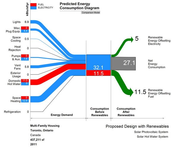
Let’s see a real example. In this chart, the creator have designed a Sankey Diagram to show the predicted energy consumption. The author also explained here how he achieved this design and you can download a free template, too.
Beside the Comparison Model, Compliance Model and Prediction Model, if you need to make a basic Sankey Diagram we can use different approaches. In PowerPoint you can start drawing shapes and then we will customize them. For the arrows, we can use simple arrows with different widths and curved effect. This is easier to achieve if we insert a curved line in PowerPoint and then change the size. We can change the line color for the input and outputs.
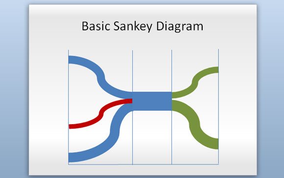
This is a very simple example showing how to make a Sankey Diagram in PowerPoint.
Sankey Diagrams can also be used in conjunction with other diagrams like Grassmann diagram for energy flow and loss or Material Flow Analysis diagrams.