Learn How to Use PowerPoint Chart Layouts
We’re going to explore the different chart layouts in Microsoft PowerPoint 2010. Now we’ll need our chart or page opened to work on. Here we already have a chart made for this tutorial, so you might want to get your own chart or one to practice with ready.
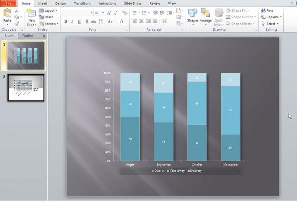
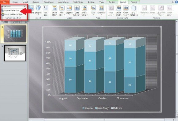
Notice in the image above that there is nothing that shows us the chart layouts. To get a different set of options in the toolbar of PowerPoint, you must click on the actual chart in the display field to get new toolbar options.

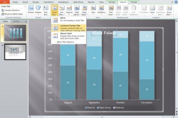
What we are going to focus on is Layout (as shown above). It will be easily identified in the green tinted box under Chart Tools. Upon clicking on the tab for “Layout”, we get even more options. The options encompass Insert, Labels, Axes, Background, and Analysis.

With Insert you will insert pictures from your computer, put shapes of different sorts on the image, and a text box on the active PowerPoint chart. Whatever is inserted is simply put over the chart and only within the borders of the selected chart. There are several options you can use to resize the image, sharpen, and style it. You are also able to move the inserted image along a vertical and horizontal axis.

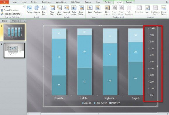
With the Label subheading—located to the right of Insert—you will be able to do a variety of things to actually define and shape the chart layout beyond what is allowed with PowerPoint’s link with Excel and the headings provided from that. The options under Label will even allow for you to display actual numerical data that the selected PowerPoint chart is based on.
Just as an example, selecting Show Legend at Right on the subtitle will place the legend to the right of the chart and change the layout in the process.
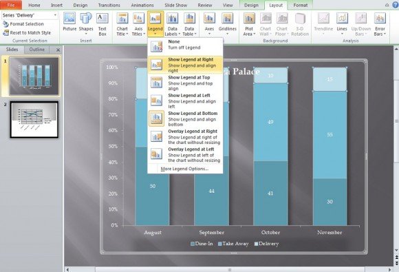
Notice that the legend (Dine-In, Take Away, Delivery) are moved to the right of the chart.
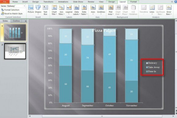
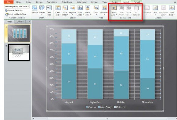
All selections under Label will change the text’s format, location, and alter/add text boxes in some way depending on what is selected. The last three selections—Axes, Background, and Analysis—add minor, visual touches to your PowerPoint chart.
The self-titled selection under Axes it will edit your PowerPoint chart along a vertical or horizontal axis. By doing this you can remove some text or mirror your chart’s content and flip everything to the alternate side completely. In the example picture below, Show Right to Left Axis was selected. This moved the scale that has been on the left the whole time to the right side of the chart.
Gridlines will simply add minor and/or major gridlines along the horizontal and vertical axis. Gridlines have been added to our example picture below.
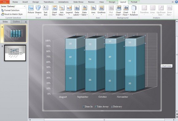
In the next major subheading under Chart Tools—Background—your editing of the chart depends on what is available to you to edit. In the above chart it is in 2D and only “Plot Area” is available. However, clicking More Plot Area Options will take you to a variety of options to work with. Some will be unavailable depending on the kind of chart you made at the start. Let’s change it to 3D for this tutorial.
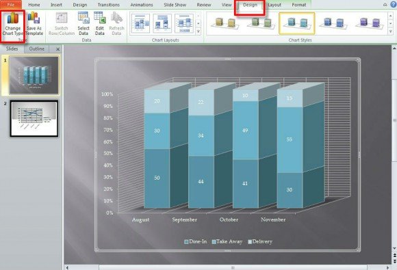
Via a quick stop in the Design tab next to Layout (within the Chart Tools green tinted/shaded boxes), you can change the active chart’s design to 3D using Change Chart Type. If you go back to Layout you’ll notice that there are more options available to you.
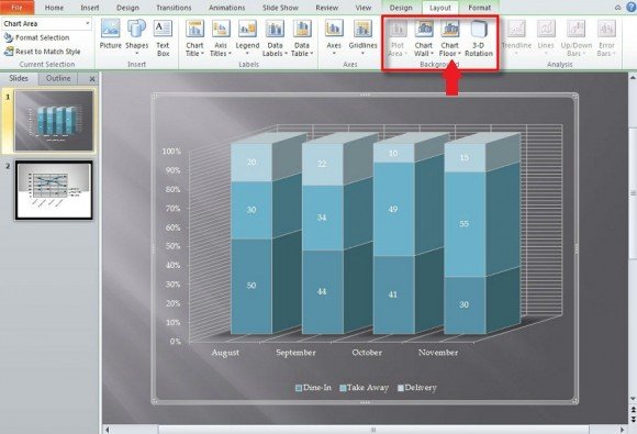
We are going to stylize the chart’s 3D elements. Guide the mouse to the selection below File (as shown in the picture below.
Next, you’ll want to select the series for the 3D elements. You can also simply click on the series on the chart which will make it the active selection. After that, click on Format Selection and go down to 3D-Format.
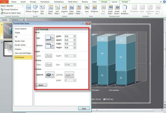
Edit what you wish for the selection and repeat for any other part you feel should be edited. In addition to the 3D element of your chart, you can edit the background and chart floor if one in available.
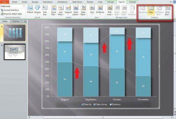
Lastly, notice the selection next to Background: Analysis. This allows you to put trendlines, lines, up/down bars, etc. to show progress and regression as shown by the bars, basically. They’re only available with 2D bars and seem better used for non-stacked charts. Below we’ve removed the gridlines and changed the PowerPoint chart back to 2D to better show the lines under Analysis.
The important thing to note is that certain selections and editing features under Chart Tools will be available depending on what design you’ve selected for your chart. If you would like to use a feature unavailable to you simply use Chart Layout’s Design tab to the left of Layout. The most often used chart designs have a 2D and 3D version and if one doesn’t work, the other will.
We will send you our curated collections to your email weekly. No spam, promise!