Find tons of free chart PowerPoint templates and backgrounds that you can download to customize your charts and presentations in Microsoft PowerPoint. Using these articles under this chart category you can learn how to build charts and customize the look and feel of your charts in Microsoft PowerPoint presentations. Also you can download free chart templates for PowerPoint and Excel.
One of the things that can really help you present statistical information in an easy to grasp manner are charts. PowerPoint charts can be a great way of making attractive data visualizations for interpreting and presenting essential data. When making chart slides, the easiest method for saving time and getting the most out of your …
In PowerPoint, you can save your chart design as a chart template for future use. This feature can be really helpful if you want to design custom charts using styles and effects and save it as a template using your corporate visual identity or brand identity. You can also use chart templates to speed up …
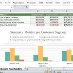
Customer profitability is the profit that a company makes in serving a particular customer or client over a specific timeframe. This is the difference between the customer revenue and the costs of having business relationships with a specific customer.
When making graphs for presentations one of the biggest issues a presenter has to deal with is to make the data easy to grasp and also to ensure that the audience can be kept attentive. Slides with graphs can hold important data but are also most likely to be ignored by the audience. You can …
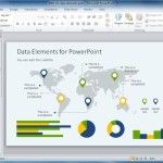
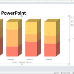
Charts can be an effective method of displaying data before an audience; as it can show a trend for large chunks of data in an easy to grasp visual representation. Moreover, dashboards with multiple sections of data can be another good method for making good use of scarce space on a PowerPoint slide. Fortunately, Slide …
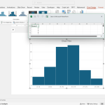
Using Excel and the free Analysis Toolpak add-in for Excel, you can create useful histograms for your spreadsheets, but also use the resulting image to copy and paste the Histogram in PowerPoint presentations. Here we will show you how to make histogram charts for PowerPoint using Excel. Here we will show you how to create …
Gaussian Curve (also known as the Gaussian Bell or Bell Curve) is a statistical curve very popular in probability theory. The normal (or Gaussian) distribution is a continuous probability distribution that has a bell-shaped probability density function, known as the Gaussian function or informally as the bell curve. You can learn more about the Gaussian function on Wikipedia …
Sometimes you need to change the bar in a bar chart while using Microsoft PowerPoint. This article can help you to understand how to edit the chart and change the default bar width. Actually yo change the bar width used in a PowerPoint chart you change the gap width (the space between one bar and …
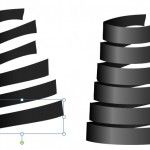
Spiral charts and Spiral diagrams can help to describe processes and concepts in PowerPoint presentations. But designing such diagrams usually require lot of time or we end purchasing premium templates from websites offering PowerPoint templates and diagrams. We can design the spiral diagram in PowerPoint using a very basic approach that includes the use of …
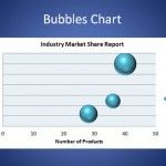
A bubble chart is a variation of a typical Scatter chart or graphic where you can place data points with different sizes, similar to bubbles. In fact, in the bubbles chart, the data points of scatter plots are replaced with bubbles. A Bubble chart can be used instead of a Scatter chart if your data …