How to Make a Double Line Graph in PowerPoint
Last updated on September 4th, 2024
Today we will show you how to make a Double-Line Graph in PowerPoint so you can create your own charts and graphs for business and economic presentations, but also useful for other presentation topics like statistics, physics and why not marketing research.
You can use the same concepts learned here to make double bar graphs, too, since the properties here also applies for the bar charts.
If you collect, organize and need to show raw data using a visualization too, bar charts and line charts or line graphs are very useful and a simple way to visualize the information that you collected in raw data as input. If you need to compare two datasets then you can use double bar or double line graphs.
Data for Line Graphs
First, we need to prepare the data to be used to make our line graphs. You may collect this data from different sources, but we will start with a really basic example for this review. Then you will be able to prepare a simple double line graph in PowerPoint by yourself.
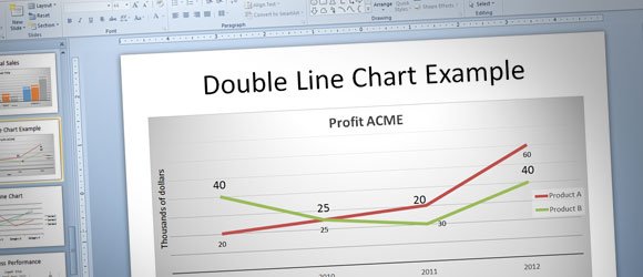
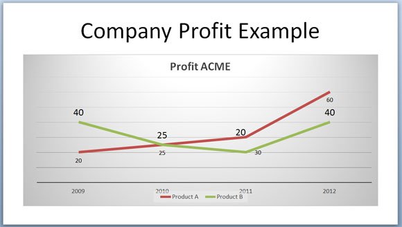
Let’s say that we need to compare profit for an ACME company for two different products. We can create a double line graph to compare a product A vs. a product B in this organization for different years. We will represent the years in the x-axis while the product profits will be represented in the y-axis.
For our example, we will use the following basic data set (data for line graphs or simple bar graphs).
| Product A | Product B | |
| 2009 | 20 | 40 |
| 2010 | 25 | 25 |
| 2011 | 30 | 20 |
| 2012 | 60 | 40 |
Create a double line graph in PowerPoint 2010
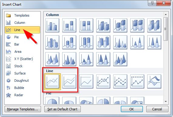
Now we are ready to create the line graph in PowerPoint. You can go to Insert -> Chart and then look for Line section. Here you can pick from different chart options. Choose the first line chart template to start with.
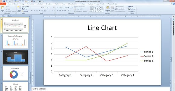
A new line chart sample will be inserted in the slide. Now you can edit the data by right cliking on the chart and then click on Edit Data.
Now we can customize the chart to make it look more attractive.
Enter the data that we specified above for data for line chart. You can enter the data in the spreadsheet.
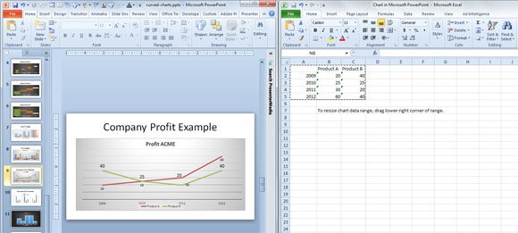
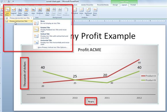
Here is an example of the double line chart in PowerPoint with a customized chart template.
You can now customize your double line chart, for example to configure where to show the horizontal and vertical axis. You can show the years at bottom and then thousands of dollars on the left axis. Also you can embed the original source data table at the bottom of the chart if needed.
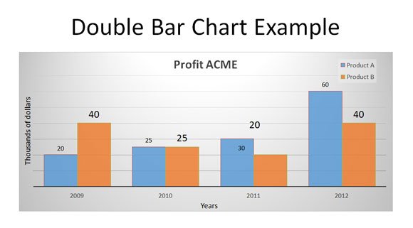
Creating a double bar chart in PowerPoint
This same data can be effectively represented using a double bar chart instead. You can easily switch from a double line chart to double bar chart. Go to Chart Tools menu on top of the PowerPoint ribbon and then click Design menu. Here click Change Chart type and then pick the first option Clustered Bar Chart from the bar charts tab.
If you need to modernize your charts in PowerPoint then you can check the article how to use PowerPoint 2013 charts in PowerPoint 2010. You can also learn how to adjust the gap between bar charts in PowerPoint, which is very helpful if you want to change the style of your bar charts graphics.