Using Bullet Charts in PowerPoint to Replace Gauges
Gauges and speedometers are used in business and corporate presentations and dashboards as a visualization tool. However if you are looking for chart alternatives then the bullet graphs and bullet charts are a good alternative to gauges.
The advantage of using bullet charts to display information is that you only require a very little space compared with gauges in PowerPoint and other meters or thermometer diagrams that are commonly used in presentations. This can be advantageous for slides when you need to show detailed information but do not have enough space to embed everything.
In PowerPoint ,you can insert vertical or horizontal bullet charts by entering percentages and numbers.
The concept of Bullet Chart is coined to Stephen Few. A bullet chart normally looks like a column chart within a column chart. It is a great visualization tool that can be used to compare compare 2 series of data together.
If you need to create executive dashboards in Excel or PowerPoint then you can use bullet charts to display key performance indicators (KPI). You can compare the actual performance with poor performance, the average performance or excellent performance levels in the same tiny bullet chart.
What is a Bullet Chart?
A bullet chart (also known as bullet graph) is a variation of a bar chart, typically consisting of a primary bar layered on top of a secondary stack of less-prominent bars. Bullet charts serve as an advanced alternative to traditional gauges and meters used in digital dashboards.
Bullet charts provide a clear and concise way to measure performance against a set of benchmarks, making them particularly useful in business or any performance-focused analytics.
The structure of a bullet chart is simple yet effective. It features a single, primary measure (like current performance or year-to-date sales), which is compared against a series of qualitative ranges (such as poor, satisfactory, and good) that demonstrate the context of the measure. These ranges are usually displayed as varying shades of a single color, getting progressively darker as performance improves.
At the heart of the bullet chart is the performance bar, a long horizontal or vertical bar that represents the actual value being measured. This bar is superimposed over the qualitative ranges, allowing viewers to assess performance at a glance. The target, which is the goal or benchmark that the current performance should be compared to, is typically marked by a vertical or horizontal line across the chart.
What is the Advantage of Using Bullet Charts in Presentations?
One of the main advantages of bullet charts is their compact and space-efficient design, which allows them to display a lot of information in a small space without overwhelming the viewer. This makes bullet charts an excellent choice for dashboards where space is at a premium but information clarity is paramount.
Moreover, bullet charts can be used to represent almost any key performance indicator that requires regular monitoring, from sales targets and customer satisfaction to production levels and financial health. By providing a visual representation of performance that is easy to understand at a glance, bullet charts help managers and analysts make quick, informed decisions based on the latest data.
How to Design a Bullet Chart in PowerPoint
Now let’s see how to design a simple but effective bullet chart template for PowerPoint. You can download this free PPT template or create your own bullet chart design in PowerPoint.
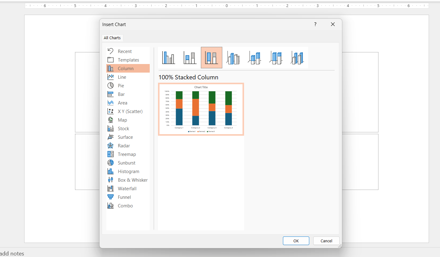
Start inserting a chart template using the 100% stacked column chart.
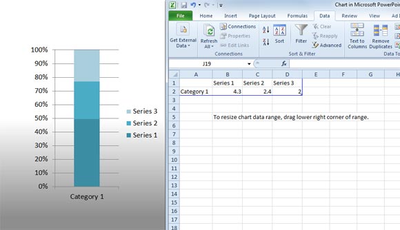
Then, depending on the number of categories you want to add, remove or add new categories. The series will be used to display Poor, Average, Excellent sections.
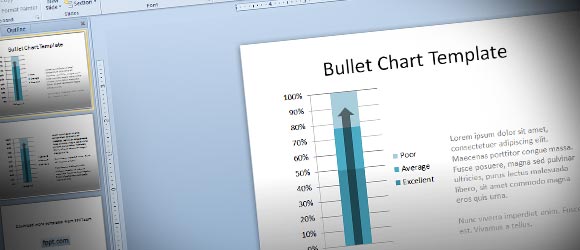
Then, you can add an arrow shape above the stacked chart to represent the bullet chart to any desired value. You can add a transparency level to the shape to make it semi-translucent. Here is a simple of a slide using the bullet chart template in PowerPoint.

You can use this concept to represent a data in any enterprise dashboard or PowerPoint presentation or you can alternatively download this dashboard toolkit for PowerPoint presentations with stunning dashboard slides and elements.
Bullet Chart PowerPoint (1862 downloads )