If you need PowerPoint Shapes, you can download free shapes for PowerPoint and learn how to make shapes in Microsoft PowerPoint.
Shapes allow you to make excellent presentations and decorate your slides with nice graphics that impress your audience. You can learn how to use and edit shapes in PowerPoint or download free shapes with 3D and 2D effects for your slides.
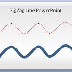
PowerPoint presentations have become a cornerstone in the world of business, education, and communication. One underutilized element that can add visual interest and impact to your slides is the zigzag line. Whether you’re using it as a squiggly arrow or a wavy line, zigzag lines can represent various ideas and concepts in an engaging way. …
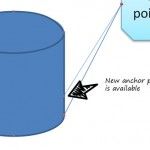
Anchor points are great for connecting lines between different shapes. This feature is very common in vector editing software and diagram applications. In PowerPoint we can also use anchor points to connect the shapes with lines and connectors. However, the default shapes available in PowerPoint (like squares, circles, arrows, etc.) comes with built-in anchor points. …
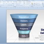
Drawing a funnel diagram in PowerPoint is possible by combining different basic shapes like an ellipse or oval and then a triangle. You can also create pipes in PowerPoint using shapes. Here we will show you how to build a simple funnel diagram in PowerPoint. You can combine different shapes to build this funnel channel …
What if someone is interested in creating a logo in PowerPoint and asking you to design one? First, you will think that he is crazy trying to design it in PowerPoint instead of using a professional logo maker or a graphic design tool like Adobe Illustrator or Photoshop for the logo creation process. The good …
Once upon a time you need to create circular arrows for your presentation slides. In PowerPoint, you can create this kind of curved and circular arrows by using different approaches. One method to create a curved arrow is using a normal arrow style or big arrow shape in PowerPoint and then edit the points to …
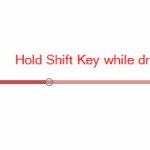
You can easily insert a perfect horizontal line in PowerPoint using shapes. The trick here is to hold the Shift key while you are drawing the line and PowerPoint will draw an horizontal and straight line in the PowerPoint canvas. You can insert a vertical line using the same approach, but instead of drawing the …
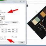
Rotate with Shapes is an option that you can check when configuring a picture as the background of a shape in PowerPoint. This option is available in the Format Picture pane when you choose Fill options, and the Picture or texture fill option is selected. It is also available when you choose a gradient fill. …
Before you start making a flowchart in PowerPoint, it is necessary to know the meaning of the various symbols that are used in it. Knowledge of these symbols is essential for presenting your chart according to the right mix of shapes. Below is an explanation for the meaning of different flowcharts symbols.
Here we will show you how to make a simple 2D dice image in PowerPoint using shapes and then we will reference some free and premium dice templates for PowerPoint that you can download for your presentations on gambling or games, but you can also use them for lectures on probability and other educational PowerPoint …
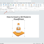
To insert a 3D Model in PowerPoint, go to Insert menu, and click 3D Model button. This will open a new dialog box to browse the 3D model collections. In our example above, we’ve inserted a 3D traffic cone in our presentation slide. Once in the slide, you can rotate the 3D Model to any …
Advertisement
Shapes in PowerPoint are very useful to create a variety of visual aids and illustrations to enhance presentations, especially in a business context.
How can shapes in PowerPoint be used? Here are seven ways you can use shapes to draw different illustrations in PowerPoint for business presentations:
Flowcharts and Process Diagrams: PowerPoint shapes can be used to represent different stages in a process or steps in a workflow. For example, rectangles for processes, diamonds for decision points, and arrows to indicate the flow direction. This helps in explaining complex processes in a simple and visually appealing manner.
Funnel Slides: Funnel templates can be used to represent processes that start broadly and narrow down, such as sales funnels, lead conversion, or any narrowing down processes. Multiple shapes, usually trapezoids, can be stacked to represent each stage of the funnel.
Timelines templates: Timelines are a linear representations of events over time. Use lines to represent the time period and add shapes (like circles or rectangles) at specific points along the line to indicate milestones or key events. This can be useful for showcasing project milestones, company histories, or future plans.
Roadmaps: Roadmaps are great for laying out the path or direction for a project or strategy. Use shapes, lines or curves to represent the road and place shapes like flags, pins, or rectangles to represent stages or goals along the way.
SWOT Analysis: SWOT stands for Strengths, Weaknesses, Opportunities, and Threats. SWOT is a strategic planning tool. Use a large square or rectangle, divide it into four smaller ones, and label each for the SWOT categories. Use other shapes inside each quadrant to highlight and elaborate on specific points. Alternatively, learn how to make a SWOT slide.
Organizational Charts: Represent the hierarchy and structure within an organization. To make an organizational chart in PowerPoint, use rectangles to represent different roles or departments and connect them with lines to show relationships, reporting structures, or flow of information.
Comparative Diagrams: To showcase comparisons between items or ideas. For instance, using two overlapping circles can create a Venn diagram to showcase similarities and differences. Bar shapes of varying lengths can be used for bar graphs, showcasing quantitative differences among categories with the help of comparison slides.
While shapes are useful for breaking down and visualizing complex information, it’s also essential to maintain clarity. Overloading your slides with too many shapes, colors, or text can be counterproductive. Aim for simplicity and coherence, ensuring your audience can quickly grasp the information being presented.