How to Make a Waterfall Chart in PowerPoint
Last updated on September 9th, 2025
The Waterfall Chart is a nice chart that helps to illustrate the change. This kind of chart is very effective and intuitive to use in PowerPoint presentations to show the total change along with a breakdown of the individual components that have driven a change.
Unfortunately, PowerPoint didn’t come with this chart type in their gallery of charts. However, we can easily tweak the bar chart available in PowerPoint to make it look like a waterfall chart. For this purpose, we will start using a Stacked Column Chart from the Chart Gallery.
What we are going to do in order to create a waterfall chart is:
- Use the stacked column chart from Microsoft PowerPoint
- Add a staggered data serie
- Modify the bottom data series to fill with a transparent style
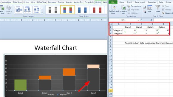
First, insert a simple bar chart from the gallery but make sure to choose the Stacked Chart from the list.
In the Excel spreadsheet, add all the required data points. As you can see in the following screenshot, consider adding the sums of each previous column to the next. So, for example, if your data points for Data Column 1 are 0 and 15, we will use 15 as the first value for the next column.
This kind of chart is also known as Build Up and Build Down. In fact, the Build Down version is the most similar to a waterfall representation. These charts are really good at highlighting individual components that build up to a total.
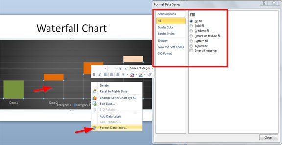
Now, select the bottom series (click there once only) and right-click to open the contextual menu. Here, click Format Data Series and then look for the Fill tab. Now, select No Fill to use a transparent color.
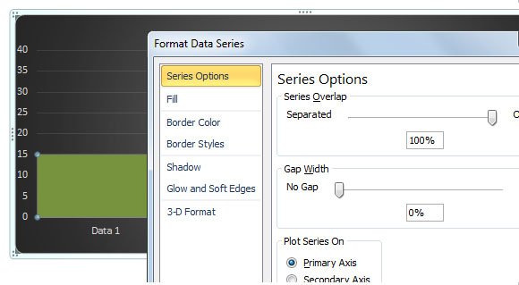
You can customize this chart even more; for example, you can reduce the gap width between bars to the minimum available.
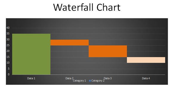
Build Up Waterfall Chart in PowerPoint
This is how the waterfall chart template will look instead:
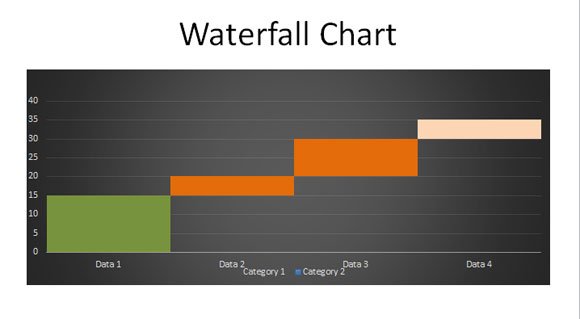
You can easily create this waterfall diagram for your presentations and customize it even more, for example to remove the dark background, grid lines and legents.
Build Down Waterfall Chart in PowerPoint
Here is another variant using the build down approach.
This kind of charts and diagrams can really help to make more attractive presentations, especially for sales and financial presentations. For example, it is commonly used to represent a financial change over the years (YoY or Year Over Year comparison chart in PowerPoint). You can also use this build up and build down chart to represent the office costs or expenses in a organization.
For your convenience, here you can download the chart template ready to be used in your presentation.
Waterfall (5675 downloads ) Waterfall PowerPoint Sample (9674 downloads )
Hey,
Love these tutorials. Thanks!
Great article.