Sparklines in PowerPoint Presentations
In the world of data visualization, sparklines hold a unique place. These tiny graphics, roughly the size of a line of text, pack an enormous amount of data into a small space, providing a clear, concise picture of trends, patterns, and variations. From Edward Tufte’s invention to their application in Microsoft PowerPoint and other platforms, sparklines have revolutionized the way we perceive and understand data. In this article, we delve into the concept of sparklines, their utility, and how you can create and use them in PowerPoint, with or without additional tools such as SparkMaker. We will also explore other free tools and methods to create sparklines, enhancing your data presentation skills to a new level.
What is a Sparkline?
A sparkline is a small intense, simple, word-sized graphic with typographic resolution, meaning that graphics are no longer cartoonish special occasions with captions and boxes, but rather sparkline graphic can be everywhere a word or number can be: embedded in a sentence, table, headline, map, spreadsheet, graphic. Sparklines, a concept invented by Edward Tufte, compress large amounts of data into intense, word-sized graphics, learn more in beautiful evidence. The definition is coined to Edward Tufte, who has been appointed by Obama recently to help on data visualization and transparent government, accordingly to Business Week.
A sparkline, a term coined by data visualization expert Edward Tufte, is a small, simple, intense graphic that is about the same size as a line of type. These graphics represent large amounts of data condensed into a format that can easily be embedded in text, tables, headlines, maps, and spreadsheets. Sparklines can be found wherever a word or number can be: they seamlessly integrate into the content to offer visual representations of data without disrupting the flow of information. The simplicity of sparklines allows for immediate comprehension, turning data into a graphical illustration that can be understood at a glance.
Why are Sparklines Useful?
Sparklines are very useful as a data visualization tool for several reasons.
Firstly, they can compress vast amounts of data into a small, digestible graphic that allows for immediate understanding. This compact representation of data allows viewers to quickly grasp trends, patterns, and variations.
Secondly, because sparklines are embedded directly into the text, they provide context to the data. This context enhances the understanding and interpretation of the data, making it easier for readers to connect data trends to the corresponding information.
Lastly, sparklines can be used virtually anywhere – from reports and presentations to dashboards and spreadsheets. This versatility makes them a powerful tool for data visualization, capable of transforming complex data sets into straightforward, understandable graphics.
How to Add Sparklines in PowerPoint?
In PowerPoint there are many different approaches to add sparklines, one of the solutions in this field is SparkMaker.
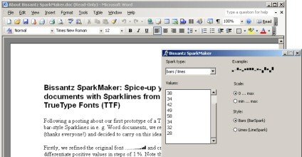
SparkMaker is an add-in for Office that creates sparklines (mini graphs) to visualize numerical data in dashboards, spreadsheets, reports, and presentations created with Excel, Word, and PowerPoint. The version 4 of SparkMaker uses a new minimized-clicks approach that helps you automatically condense your data into sparklines.
Here is a list of features that you can find in SparkMarker:
- Supports various sparkline types: bars, lines, winner/loser (whiskers), pie charts
- Creates sparklines directly in your PowerPoint presentations but also in Word and Excel
- Generates sparklines either textually using TrueType Fonts or as vector-based images (EMF)
- User-defined functions for dynamic sparkline updates in Excel XP, 2003, 2007, 2010
- Flexible scaling of sparklines
- Additional statistical information: standard deviation, trend
- Multiple formatting options, such as color and landmark values
- New: now also available in sparkline functions
- Enables high-quality print-outs
- Exports to popular bitmap image file formats: BMP, GIF, JPG, PNG, TIFF
- Supports Microsoft Office 2000, Office XP, Office 2003, Office 2007 and Office 2010
If we need more advanced features or design our own Sparklines in PowerPoint, then we can try to use the draw tool and insert a freeform shape in PowerPoint.
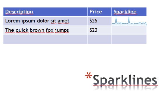
If you don’t want to pay for this tool, then you can create your own sparklines using PowerPoint or other free tools. In particular, you should be aware the Google Chart API has a Sparkline chart that you can generate with a simple URL. In this slide below we have inserted a sparkline chart from Google Chart API into the PowerPoint slide. You can do this just as you did with images (see Inserting images in PowerPoint).
In this example below we have used a Google Chart sparkline to simulate a sparkline visualization inside a PowerPoint table. You can use your own sparkline code and data to embed an image like this using Google Chart API. You can learn more in the API doc (Google Docs API Sparkline)
Other ways to add Spark lines to PowerPoint presentations
Instead of using an add-in to generate a sparkline, you can use Microsoft Excel. Create a sparkline in Excel, and then copy and paste the chart to PowerPoint.
Alternatively in Photoshop we can use a script to create sparklines, but there are other articles in the Internet where you can learn how to create Spark Lines in an advanced way. For example, you may want to add spark lines in Excel and then port it to PowerPoint like explained in this post from Office. Or you may want to generate online spark lines using an inline sparkline generator.
Conclusions
Sparklines have come a long way since their inception by Edward Tufte, now finding a crucial place in modern data visualization techniques. They allow for efficient and effective communication of data trends and patterns in a compact, easily understandable format. Through this article, we explored the concept of sparklines, their uses, and various ways of creating them in PowerPoint, both with the use of SparkMaker and without. We also looked at alternative free tools for creating sparklines, providing you with multiple options to enhance your data representation skills. As we move forward in the era of big data, tools like sparklines will only continue to grow in relevance and importance. Equip yourself with these skills and stay ahead in the game of effective communication and data presentation.