How to Make a Geographic Heat Map in Excel
Visualizing data can help you better understand what could be a difficult set of information if you’re just looking at purely numbers. This is why charts, graphs, infographics and geographical heat maps are very useful, not just in reports and presentations, but also in helping you make sense of data. Such visualizations can also help you better spot trends, analyze large chunks of data, and make better and informed decisions. While charts, infographics and graphs are easier to make heat maps can be a bit tricky. Here is how to make a geographic heat map in Excel.
Visualize Geographic Data
For geographic data, it can be difficult to make sense of what happens in a certain region or location if you just have tables and numbers. You can’t have a good picture of the situation with just these. This is why having a geographic heat map is handy. However, not everyone can create a geographic heat map. First of all, it can be tedious to analyze all the information manually and to translate it in visual format especially if you’re not really into graphic design. However, with the Geographic Heat Map add-in for Excel, you can easily do so.
This add-in automates how you visualize data over a geographic region or location. It can provide you with a detailed map that allows you to reflect your data on it with the use of colors. Intensities of conditions based on the values on your data set can be presented using the heat map.

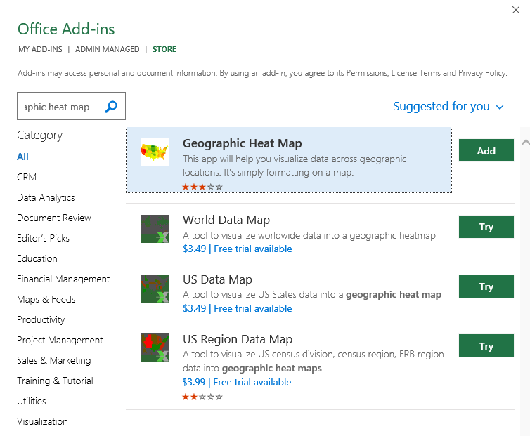
Get the Heat Map Add-in for Excel
To get the Geographic Heat Map add-in for Excel, you can go to Microsoft’s AppSource. Just type in the keyword or the name of the add-in in the search bar. Once you see the Geographic Heat Map add-in, just click “Add” and follow the instructions to download and install until it takes you to Excel, where you complete the process.
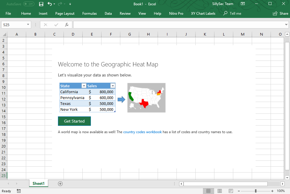
Once the add-in is successfully installed in Excel, you can see the Geographic Heat Map dashboard populate in the middle of the spreadsheet. Here, you can start creating your heat map by clicking on “Get Started.”
Then, you can choose your map, which is either a world map or the US map. Then, you can choose your columns and row ranges where to get the data from your spreadsheet. You can also choose a color theme, which can be Grayscale, Red to Green, and Green to Red. Then, you can type in your title and then when you’re done, just hit “Save”. You can see your very own geographic heat map reflecting your numerical data.
With the Geographic Heat Map add-in for Excel, you can create detailed visualization of data regarding sales, populations, statistics, demographic data, and so many more. Such a map will show you the condition or information within a specific area in the map and how this relates to the rest of the geography.
Once you’re done, you can then embed your heat map in your reports in Word, PowerPoint or other file formats.