Methodologies can often be complex and much of the core concept can often get lost in translation. Data visualization aims to bridge this gap by adding substance to the methodology. And arguably, none explains it better than Edward Tufte! Who is Edward Tufte? Edward Tufte, sometimes known as ET, is known for his simplified data …
With the digital era revolution, there was a boom of data and information at the front of every professional and academic circle of life. The abundance of the information available at the single click of every user in the world made it easier to approach every type of knowledge and information but at the same …
Complex data, trends and analysis can be quite difficult to explain to an audience in raw form. Many presenters and analysts try to represent such information using tables and charts, however, looking at data in statistical form with a few legends and headings isn’t all that easy to soak in for an audience. This is …
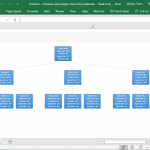
Visually organizing information helps map the relationship of different nodes represented in the visualization. There are different types of visual organizers and tools that can be used for this purpose. If you would like to learn about the different visual organizers and methods to organize your information, let us provide you with a list of …
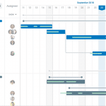
Trello is a a popular project management tool. Trello uses the Kanban approach for visualizing workflow, with Kanban boards, cards and lists making Trello easy to use for managing projects. GoodGantt is an extension for Trello which helps convert Trello boards into Gantt charts.
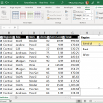
Using a Slicer in Excel is one of the best ways for you to filter your data. This is especially true if you have a large and complex data set. If you want to figure out a single category or view a specific data set under specific conditions, then a slicer can help you with …
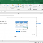
Microsoft Office programs such as Word, PowerPoint and Excel have been around for so long. They’re widely recognized and used in many business and academic activities, and considered as reliable companions in creating documents, managing data, or presenting an idea. While these programs are great in themselves, add-ins are there to make things a little …
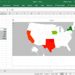
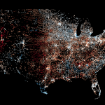
Visualizing data can help you better understand what could be a difficult set of information if you’re just looking at purely numbers. This is why charts, graphs, infographics and geographical heat maps are very useful, not just in reports and presentations, but also in helping you make sense of data. Such visualizations can also help …
Working with Excel spreadsheets and analyzing data as well as catching trends can be tedious and time-consuming. However, it must be done. Analyzing data is important, especially at this time when we deal with large amounts of information on a daily basis. To help you make better sense out of your data, you can use …
Data visualization can make everything look better and more understandable. From simple stats to comprehensive analysis, visualization tools such as charts and graphs can greatly help you gain better insight into your business, projects, surveys, and reports. With this in mind, Microsoft has developed SandDance, a free data visualization app that helps you create stunning …