How to Choose a Good Chart for PowerPoint Presentations
Last updated on September 9th, 2025
Selecting the appropriate chart is one of the most effective ways to convey data-driven insights in a presentation. PowerPoint provides a wide variety of built-in chart types, and with its integration with Microsoft Excel, you can either paste charts directly or link them to an Excel spreadsheet so that updates in the source file are automatically reflected in your slides. This makes it easier to maintain accuracy and consistency in your visualizations.
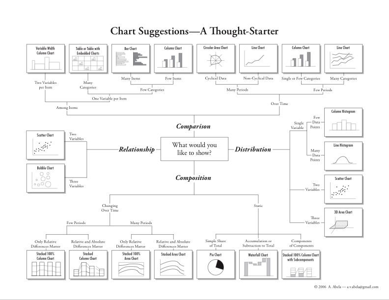
Image (c) Andrew Abela
Andrew Abela, founder of Extreme Presentation, developed a widely recognized Chart Chooser framework that helps professionals identify the best chart for different types of messages. His hierarchy categorizes charts into four main purposes:
- Comparison: Highlighting similarities or differences between items.
- Relationship: Showing correlations or connections between variables.
- Composition: Explaining how parts contribute to a whole.
- Distribution: Displaying the spread or frequency of data.
This approach encourages presenters to begin by asking: What message do I want to convey? Once the objective is clear, the framework makes it easier to select the most effective chart type.
You can start thinking in terms of what kind of information you want to show or the message that you want to convey. Then, using this chart hierarchy can help you to decide which is the best chart type for a given situation.
Examples of Chart Selection
Consider a scenario where you want to compare two products. A comparison chart would be the natural choice. Depending on the data, you might use:
- Column charts for straightforward comparisons across categories.
- Line charts with multiple series to track performance over time.
- Radar (spider) charts to evaluate multiple features or attributes side by side.
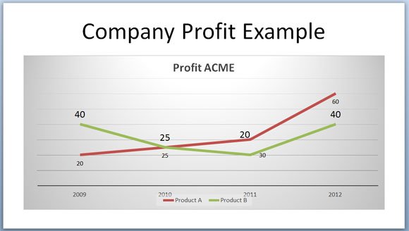
For example, a dual line chart in PowerPoint could effectively compare Product A vs. Product B over a given time period, helping the audience quickly grasp relative performance.
Tools for Choosing Better Charts
The example below can help you to understand how a double line chart in PowerPoint can be used to compare against two different variables, in this case Product A vs. Product B.
Another good trick to choose a good PowerPoint chart is by using some of the free chart templates for PowerPoint or chart choosers. Chart Chooser is a free tool from JuiceLabs that let you choose between different chart categories.
While PowerPoint provides all the standard chart types, additional resources can make the process easier and visually more engaging. One such resource is Chart Chooser by Juice Labs, a free online tool that suggests chart types by category and offers downloadable templates. These templates not only save time but also provide professional color schemes that can improve the overall look of your slides.
Another valuable strategy is to modernize your PowerPoint charts. Even if you are using older versions of PowerPoint, updating chart styles, through clean layouts, subtle color palettes, and simplified data labels, can significantly enhance clarity and audience engagement.
Final Thoughts
Choosing the right chart is not just about aesthetics; it is about aligning your visualization with the message you want to communicate. By starting with the purpose of your data—comparison, relationship, composition, or distribution—you can select the chart type that delivers the clearest story. Leveraging frameworks like Abela’s Chart Chooser, along with modern design practices, ensures your presentations are both professional and impactful.
One comment on “How to Choose a Good Chart for PowerPoint Presentations”