Break Even Analysis Template for Excel 2013 With Data Driven Charts
Every business needs a way to forecast its costs and sales in order to plan and make crucial decisions. This is because forecasting sales and costs allows the company to know if they are going on the right track with their company’s various activities.

A Break-Even Analysis is a well-known and widely used tool. A business can say they it has reached its break-even point when its total sales or revenues goes equal with its costs or expenses. This break-even point is the minimum limit of profit when determining margins. When they go down this point, a business can say that it is not going well. When they are above the break-even point, they can say that they have a good margin and the business is earning profit.
Microsoft Office has many financial report templates and among this is its Break-Even Analysis Template for Excel 2013 with Data-Driven Charts. This Excel Template is professionally designed to clearly show and calculate fixed costs, price, volume, and other factors affecting a business’ net profit. With this template, a business can see how much it needs to sell before it begins to make a profit.
Parts of the Break-Even Analysis Template
This Break-Even Analysis Template for Excel 2013 with Data-Driven Charts is one of the latest templates for Excel 2013. It has multiple features that makes it very convenient and user-friendly even for those who do not have an accounting background.
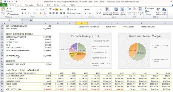
The Break-Even Analysis Template contains rows for Sales, Variable Costs, Fixed Costs Per Period and Results. Under these major headers are the specifics, like the Insurance, Administrative Costs, Property Tax, and Rent for the Fixed Cost Per Period. This way, you can clearly see specific information for various financial activities. At first glance, you can see where your finances go in and out of your business.
What is great about this Break-Even Analysis Template for Excel 2013 is that it has a dedicated set of cells where you can see your company’s Sales Volume Analysis. Like the whole Break-Even Analysis Table, This Sales Volume Analysis is a separate table complete with its own formula to automatically calculate and update data as you input them. It contains Sales Volume Per Period, Sales Price Per Unit, Fixed Cost Per Period, Variable Costs, Total Costs, Total Sales, and Net Profit (Loss). In this table, you can see how your business is doing and whether it ultimately has earned a profit or is at a loss.
Data-Driven Chart Feature
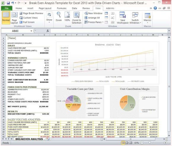
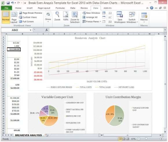
Another great feature of this 2013 Excel Template is that it comes with Charts so you can visually see data without looking closely at the figures. This feature is great so you can easily embed these charts into a PowerPoint presentation if you are to make a report or presentation. Instead of creating charts of your own and spending more time with it, you can just make use of the pre-made charts at your disposal.
There is a separate chart for each crucial data for your Break-Even Analysis; including, Break-Even Analysis Chart, Variable Cost per Unit, and Unit Contribution Margin. Each of these charts are linked to the Break-Even Analysis table so any modifications made in the table are automatically reflected in the charts.
You can use this Break-Even Analysis Template for Excel 2013 with Data-Driven Charts periodically so you never miss a beat in your business’ finances and even make professional-looking reports using the charts.
You can download this Break-Even Analysis Template for Excel 2013 with Data-Driven Charts in Office.com.