How to Add a Trendline Chart in PowerPoint
Last updated on February 25th, 2024
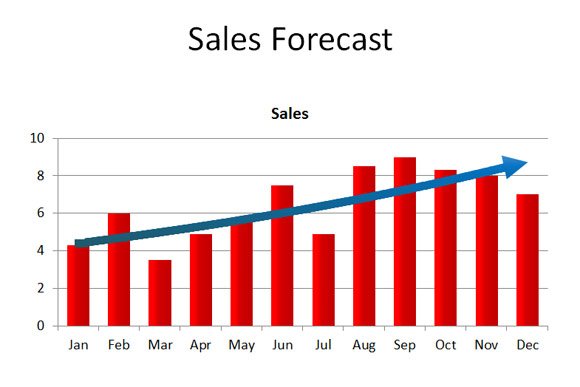
Trends can help to visualize the big picture while looking at a 12-months sales chart or Year-to-Date chart in accounting or financial PowerPoint presentations, but other sectors or topics of interest will also benefit from trends.
How to show trends in powerpoint? In PowerPoint (and also in Microsoft Excel) you can add trendlines to your charts, as well as moving average lines, by certain number of periods. In this article, we will show you how to add trendline charts in PowerPoint.
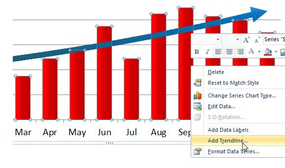
Once we have the chart inserted in the PowerPoint slide, right click over the chart to display the popup menu.
Here, click the Add Trendline option.
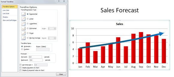
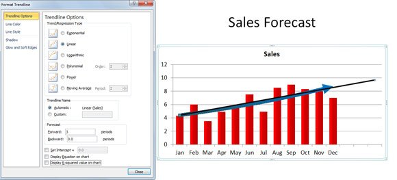
This option will display a new dialog box where you can configure the moving average line or trendline. The line will be added to the existing PowerPoint chart to show the trend. In a sales forecast chart this is very useful to see if the trend is positive or negative.
You can change the linear regression type used to display the trend. For example, the figure below shows a linear trend line instead of exponential. Besides these two options there are other regression types that you can choose: Logarithmic, Polynomial, Power, Moving Average by periods, Exponential, Linear.
Adding Multiple Trendline Chart in PowerPoint Presentations
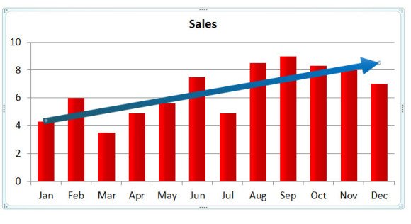
You can combine different trendlines, for example if you want to use a different regression type. In order to add a secondary trend line to a PowerPoint chart, just right click and then click Add Trendline again. For example, in the figure below you can see a secondary trendline with using the linear regression and Forecast forward set to an additional Quarter showing the positive trend.
Adding a trend or moving average line to a chart in a PowerPoint slide following this procedure is very simple and can help you to prepare awesome forecast presentations with trend lines. The article Using Trendlines in PowerPoint can also be useful or alternatively you can download chart PowerPoint templates and free presentation designs.