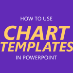
Download free chart templates for PowerPoint presentations and learn how to make your own 2D and 3D charts for PowerPoint presentations. Find useful chart ideas and visualization tools that you can use for sales presentations or any presentation requiring a chart design.
In PowerPoint, you can save your chart design as a chart template for future use. This feature can be really helpful if you want to design custom charts using styles and effects and save it as a template using your corporate visual identity or brand identity. You can also use chart templates to speed up …
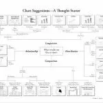
Quad charts are a highly effective tool for presenting complex information in a visually appealing and easily digestible format. These charts divide data into four distinct quadrants, allowing you to convey multiple ideas or datasets in a single slide. Used across various industries, from business and marketing to research and education, quad charts can help …
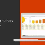
When it comes to productivity and collaboration, Microsoft Office is leading the game. Not only does it have the most advanced programs and features; it also keeps updating them to suit the needs of today’s users. One of its biggest selling points today is its collaborative feature. This allows Office users to work on the …
Selecting the appropriate chart is one of the most effective ways to convey data-driven insights in a presentation. PowerPoint provides a wide variety of built-in chart types, and with its integration with Microsoft Excel, you can either paste charts directly or link them to an Excel spreadsheet so that updates in the source file are …
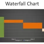
The Waterfall Chart is a nice chart that helps to illustrate the change. This kind of chart is very effective and intuitive to use in PowerPoint presentations to show the total change along with a breakdown of the individual components that have driven a change. Unfortunately, PowerPoint didn’t come with this chart type in their gallery …
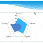
Charts are very useful when we need to explain certain data to an audience and want to avoid full text paragraphs. By using charts we can follow the rules of an image showing more than thousand words. Here we will see how to insert a radar chart in PowerPoint. To create and insert a Radar …
A project manager’s task, in essence, is to get things done. Project management requires thorough and careful planning and close attention to details as the tasks get accomplished one by one. Project management is part of many business activities and is an important key in many operations.
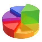
A quarter circle is a useful graphic which helps us divide information in 4 categories and create correlations. Today we are going to show you how to create a quarter circle in Powerpoint using the Pie Chart Tool. You can create a simple quarter circle using the Pie Chart. To create a Pie Chart go to Insert …
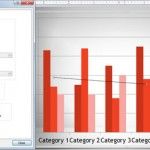
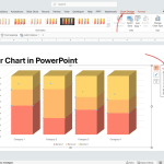
Charts can be handy in presentations where you need to show data. This is sometimes preferred against complex tables as a visualization tool because the audience can get a better view of what you want to show. However, the charts should be prepared according to your presentation to make them readable. PowerPoint charts are very …
Chart layouts in PowerPoint can be used to enhance your presentation charts. Chart layout is a menu under Chart Tools that is visible when you open or select a chart in the slide. From this menu you can control how the chart layout will be displayed on the screen and you can definitely use this …