Infographics: A Visualization Tool in Modern Marketing and Business Activities
Last updated on September 29th, 2024
With the digital era revolution, there was a boom of data and information at the front of every professional and academic circle of life. The abundance of the information available at the single click of every user in the world made it easier to approach every type of knowledge and information but at the same time, it was difficult to process that data. Hence, researchers and data specialists started finding alternatives to the conventional style of data format like plan written text notes, reports and research papers and marketing materials like newsletters, pamphlets etc. A visual format of data presentation that concisely incorporated every type of data in an efficient and engaging way was needed.
Infographics are usually the visual representation of the data and information. Every element of the infographic aids in presenting and digesting the given data in a more collaborative and effective way. It has the ability of serving any piece of complex information without wasting any time. It usually includes charts, visuals, and icons to better convey the message of the writer to the reader in a packaged form including all necessary simple and comprehensive terms combined at a single place.
Historical perspective of infographics
The history of the infographics dates back to a really ancient era some 25,000 thousand years ago in serra da capivara caves in Brazil. The prehistoric caves that hosted the ancient paintings and infographics may be one of the oldest in the Americas. The same goes for China where the Dunhuang star atlas containing almost 1300 stars depicted in the infographic picture has been preserved since 649 and 684 AD.
Later on William Playfair developed modern statistical graphics including charts like pie chart and bar chart in the late 1700s. In the 20th century the design element as we see today in most of the infographics started emerging after Sunday Times started publishing infographics on a regular basis in its every edition. Ever since their usage has been seen to an exponential extent where most of the businesses’ marketing campaigns, educational information and data visualization in general context occur on a regular basis using infographics.
8 Key Elements of Infographics (Main Sections)
Owing to the importance and Value generation of the infographics, specific elements are defined universally to be included while developing or generating any infographic design. We can call this the anatomy of an infographic and will let us create powerful visuals. The infographic design ideas below can help to understand how infographics are made, their main sections or key elements, and how they can be used to improve our visual communication.
1. Explainer Section
Here you briefly describe the whole summary of your infographic. The infographics don’t need to be comprehensive and detailed. Only relevant and concrete information is required at the start to give an idea of what the reader is going to get in the next sections.
2. Infographic Sections
Here you develop and divide each section using visuals, graphics like icons, lines, charts, etc. remember each section has separate importance so don’t neglect the visual and design appeal in any section.
3. Section text
Here you concisely describe what the section is all about and what the reader is going to get in that specific section. Every section should emphasize the visual aspect of the infographic, not the elaborative text that may go the other way around.
4. Headline
A catchy headline is one of the vital elements of an infographic because along with the visual appeal, one of the most important text elements that the reader usually sees first is the headline of the infographic. Remain brief but the main idea of the whole infographic should be depicted in the headline of the infographic.
5. Labels
Use labels and subheads to illuminate the other important sections of the infographic. Try to be creative because the little details impart a great deal of value to the overall offer of the infographic.
6. Design elements
Use such a design, color strategy, and visuals that highlight the core purpose of your infographic. The design should be aligned with the essence of the message being conveyed through infographics. Other infographic design ideas can be found online in sites like Pinterest, Dribbble or even in Google Image Search.
7. Call to action
A Your call to action might be is necessary if you try to persuade the reader to because there you can urge the reader to perform a specific action. If your reader is educated well enough and doesn’t get invited to perform a specific activity, the overall purpose of the creation of the infographic may be lost. Especially in marketing and branding campaigns where the CTA is directly related to brand awareness and sales activity, its significance enhances. In other cases, a CTA might not be required for example if the purpose of the infographic is not to take any action but to educate the user in one way or the other.
8. Citation of the references
In the end, you can briefly mention the sources, especially when facts are mentioned or data from surveys too if you want. This might not be a is not a necessary step all the time, but you would want your audience to get more informed and educated, hence this little action can be helpful in increasing the user experience of the reader. Furthermore, it is a good practice to cite the sources and give the reader the chance to research further on the topic, if needed.
When to use an infographic?
According to UppercutSEO.com, if you want to convey an idea or message that will be more likely not entertained by the audience through conventional text-based formats, infographics can prove to be decisively beneficial in conveying and retaining the information in the prospective reader’s mind. The communication channel that infographics utilize unlike others incorporates the visual appeal that helps to grab the reader’s attention for a longer period of time. Hence it is beneficial to use a method that is equally concise yet preferable by the audience for various educational, business, and personal purposes.
Entities that use Infographics in everyday practices
Infographics are universal in their use and can be used by various industries in changing domains for various purposes. The beauty of infographics is that it amalgamates itself with every type of data and industry and this makes it the number one option for several industries to convey their useful information to their relevant audiences in a short, engaging yet productive manner.
Digital Marketers use infographics to design their branding and marketing strategies for social media and internet usage mostly. Infographics provide them the channel through which the conversion chances of the potential clients are higher and digital marketers have seen that good infographics increase the chances to receive organic links and build a better brand awareness. Governments and state-related departments may use infographics for the statistical data provided to the masses on various occasions.
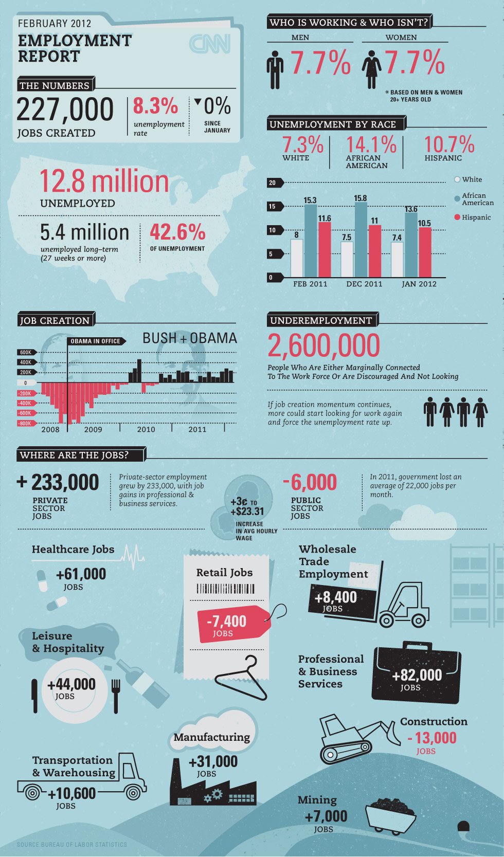
Source: New infographics are added online every day.
Educators may also use infographics as a tool for simplifying their teaching-related ideas and terminologies that may not be presented easily other than infographics. The good thing about infographics versus other materials is that it helps to visually grab the interest of a reader in a glimpse.
Non-profits also use infographics to spread awareness about their cause and fundraising campaigns, too.
Infographics In Presentations
While presenting important data and information in the form of a presentation, it is important to keep the listeners engaged till the end of the presentation to generate an effective outcome. But how to maintain the interest of the audience till the end of the presentation. But how to formulate the strategy of arranging the data in the presentation? Does your presentation need to be spiced up for better reader engagement?
Like the quote “A picture says a thousand words” suggests that you need to prioritize your data in a way that inculcates the graphical sensation to the real message of the information being conveyed. You can prevent the overwhelming audience by delivering them the most relevant information in the best engaging way possible through infographics.
You are actually illustrating the visual figure of the data and information of the whole content of the presentation. Without it, the statistical dimensions of the presentation may seem a bit out of scope. By offering the facts and figures in a hierarchy that are related to the main purpose of the presentation, you can tell a story that cultivates the interest of the audience and sustains their attention span for a longer period of time.
Our free presentation templates also use the storytelling approach embedded with visually appealing and customized designs that can be used for every type of business and communication activity. Alternatively, you can use a free online infographic maker tool to make infographics for your presentations, or learn how to make infographics in PowerPoint.
Advantages of including Infographics in our content strategies
Content is the king in almost every domain of life. The communication done through the medium of the infographics when enriched with a storytelling approach can generate exceptional results. Don’t start stuffing the infographics with the links to your prospective funnel or desired destination. The purpose of the infographic is to demonstrate to your reader what you can offer to him/her by consuming a minimum of his/her time.
One of the most prominent benefits is that humans process visual information 60,000 times faster than a textual one. By presenting the desired content and data in the format that will persuade the readers to perform any desired action, it is the best practice to use infographics that incorporate visual and graphical elements to depict the even complex statistical reports of the financial analyses.
Infographics can draw a complete illustration of the story being told visually by using the leverage of engaging graphics and design elements. A precisely designed infographic can prove to be a vital marketing tool in various business activities.
They are easy to digest and process. They are easy to share with your peers and friend circles to spread the message in the most engaging and eye-catching way instantly. The response that is generated through infographics is also great because the graphical representation makes it an easy target for the mind to capture and insert focus on.
If you want to become an authority in your domain and want to influence specific people regarding your expertise and skills then you can use infographics for spreading your knowledge and useful tips and tricks, this also applies to resumes and CVs. Many prominent figures like Brian Dean and Larry Kim have got their fame through the precise and effective usage of infographics in a consistent way for a considerable amount of time.
And lastly, infographics help you boost your sales if you are using them in your marketing campaigns. You can easily manipulate your readers and lead them to perform a specific call to action based on the information that you will share in the infographic. Hence the marketing efforts are assisted through the visual appeal of the infographics to spread the brand awareness of the businesses.
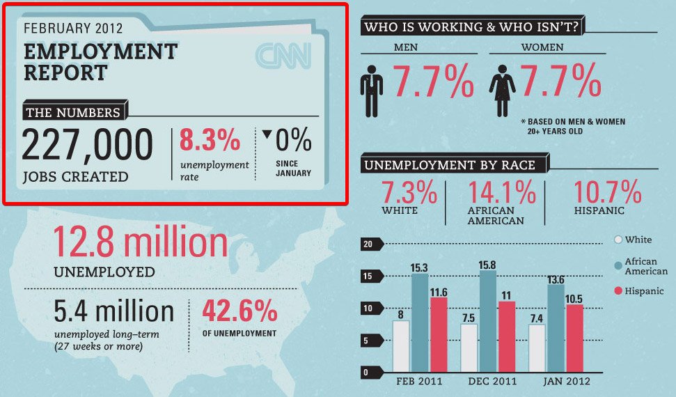
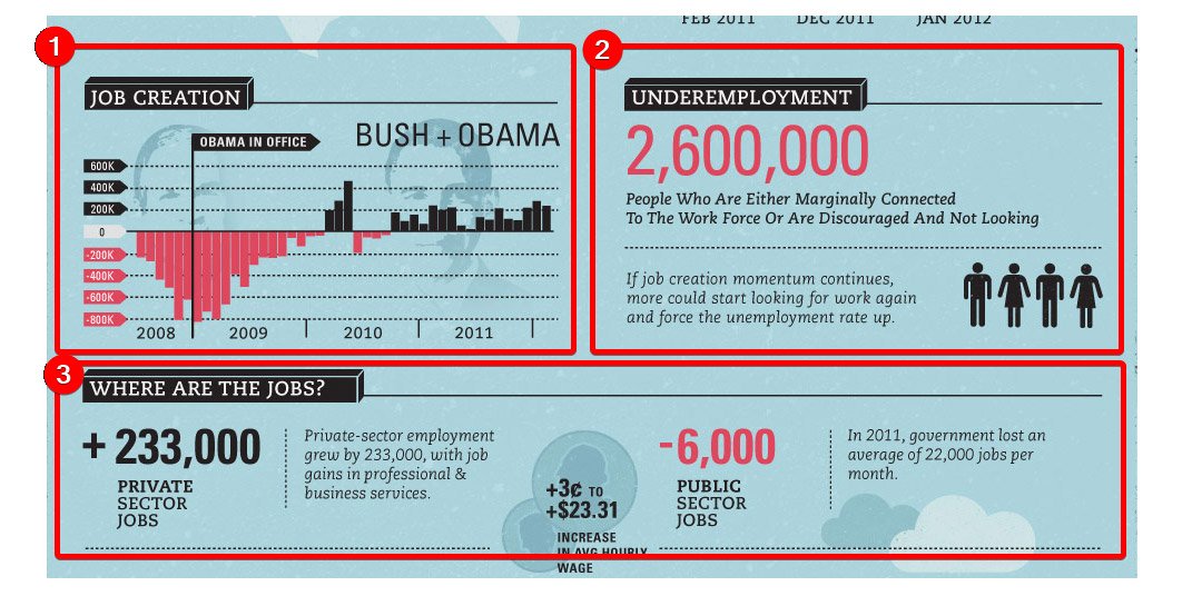
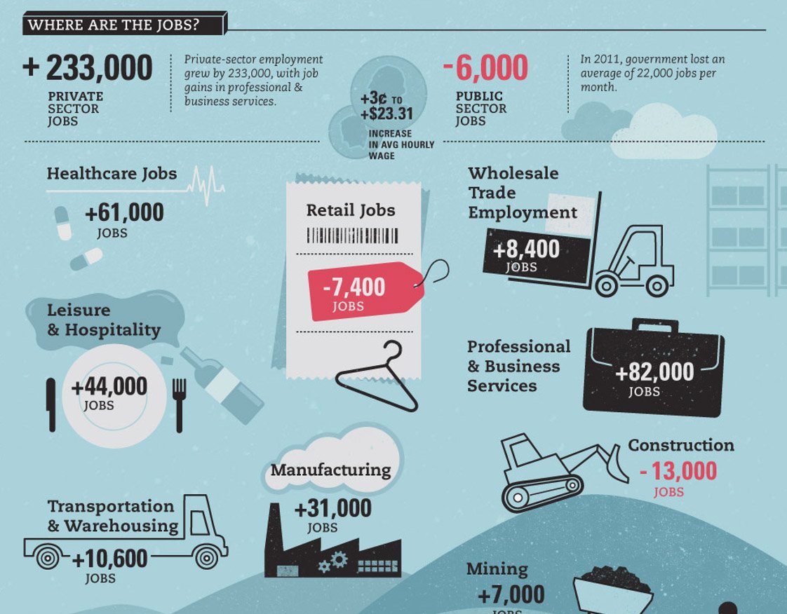
Real-life examples of successful infographics:
Final words
Infographics are the visual representations of the data and information being delivered in a concise yet effective way. The main purpose is to engage readers with a touch of visual appeal that will enhance their attention period during their interaction with the prospective content. The retention rate of the information presented through infographics is relatively higher than contextual content hence many businesses, educational institutes, governments, and nonprofits utilize the infographics on a daily basis for their various content delivery and public awareness purposes.
We will send you our curated collections to your email weekly. No spam, promise!