Add Labels to XY Chart Data Points in Excel with XY Chart Labeler
When you’re creating charts and graphs in Excel, the process is pretty much straightforward. You use the built-in Wizard within Excel to create compelling visuals that analyze and represent your data. Usually, when you create charts, you can format your chart labels with Series Name, Category Name, and Value. You can label them however you want and format them in a way that stands out so they’re readable against the objects in the chart. When you want to create more labels, such as the X and Y data points to be more specific, you can use the XY Chart Labeler.
Use this Cool Tool to Label Your Charts
The XY Chart Labeler can help you create a more detailed chart, which you can’t otherwise do without this nifty add-in specially made for Excel.
This is pretty much how it goes when you’re creating charts in Excel. However, you may come across instances when you want to make more sense of the data and put more labels on them. Sometimes, this is important so that you can give your audience a better picture of trends and events concerning your data and thus create a richer experience for reports and data analysis.
In such cases, you would need to also label your X and Y coordinates to mark your specific places in the chart. This will help make sure that your charts are not only clear and understandable to you but also for your audience, whoever they may be.
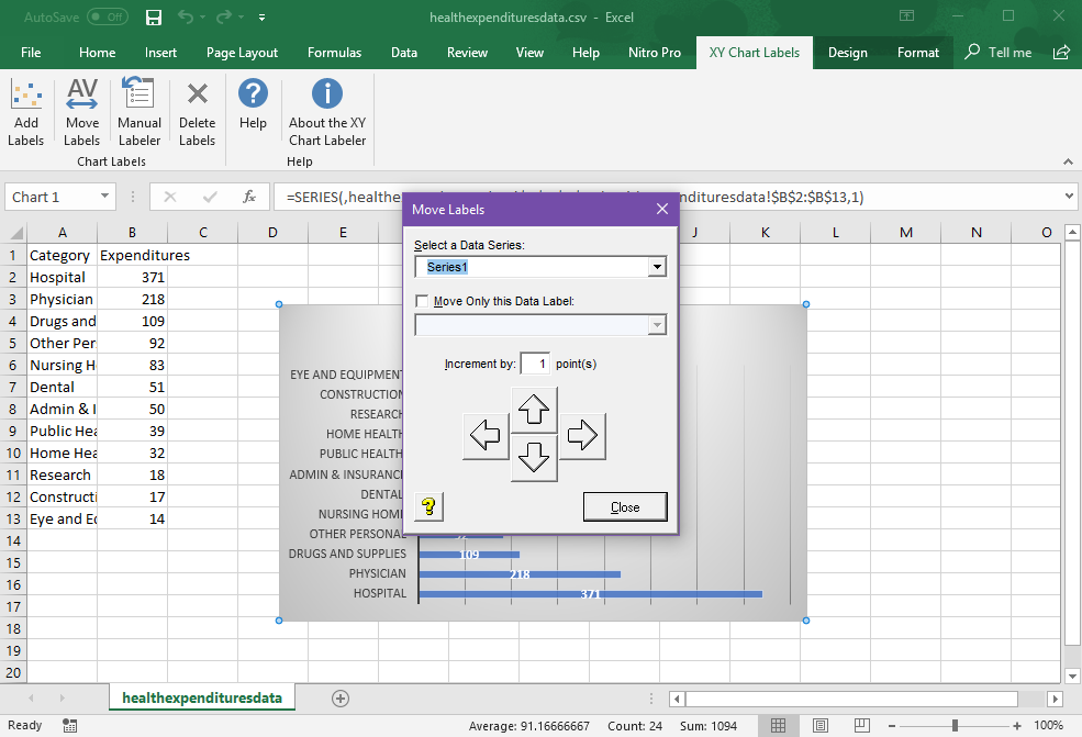
Using the XY Chart Labeler, you can add XY chart labels on your data series based on any cell range in your worksheet. Aside from this, you can also move the XY chart labels you created anywhere in your worksheet.
This add-in is also useful if you don’t want to add labels on all X and Y data. With the manual labeler feature, you can just choose to label any point on the chart you want and then customize it. This allows your chart to be less cluttered than when every X and Y point is labelled, and only the most critical points are emphasized.
You can also easily delete the chart levels in this add-in without affecting the data and the overall look of your worksheet.
Create Labels and Customize Them
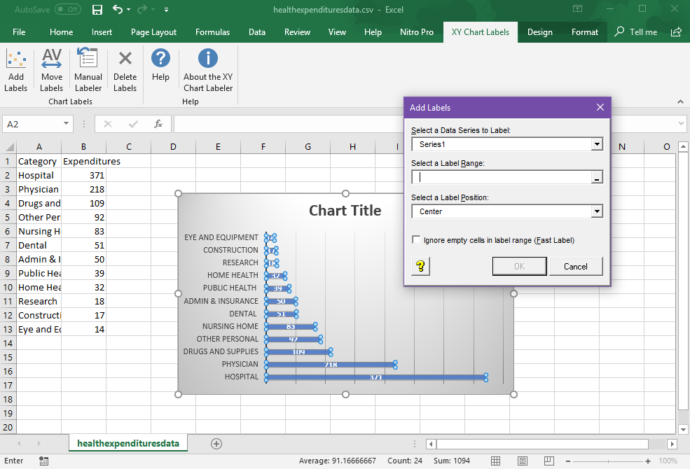
To use the XY Chart Labeler is simple. You can create a chart as you normally would. You then create a set of custom labels for each data point or series in your chart. The chart labeler tool will help you out with this, so turn on the add-in.
Once you have installed it, you will see a tab named XY Chart Labels. Click Add Labels to populate a new small window where you can customize your labels. Here, you can choose from drop-down lists the data series you want to label, the label range, and the label position. Click OK to finish. Now, your new labels will appear on the chart. You can then move your label anywhere in the chart using the arrows.
This tool is available to download for free. It can be used for Windows, Excel for Mac 2011, and Excel for Mac 2016.