Advertisement
SEO Gadget for Excel: Using Excel as an SEO Tool
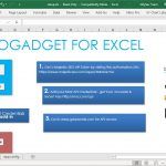
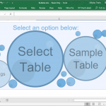
For a very long time, we’ve relied on Microsoft Excel to make better sense of data, organize and sort them, as well as make calculations. We also use Excel to visualize otherwise complex information, create reports, solve problems, and generate valuable insight. SEO Gadget for Excel can help streamline your SEO related data management tasks.