Change the Bar Width in a PowerPoint Chart
Last updated on September 3rd, 2024
Sometimes you need to change the bar in a bar chart while using Microsoft PowerPoint. This article can help you to understand how to edit the chart and change the default bar width.
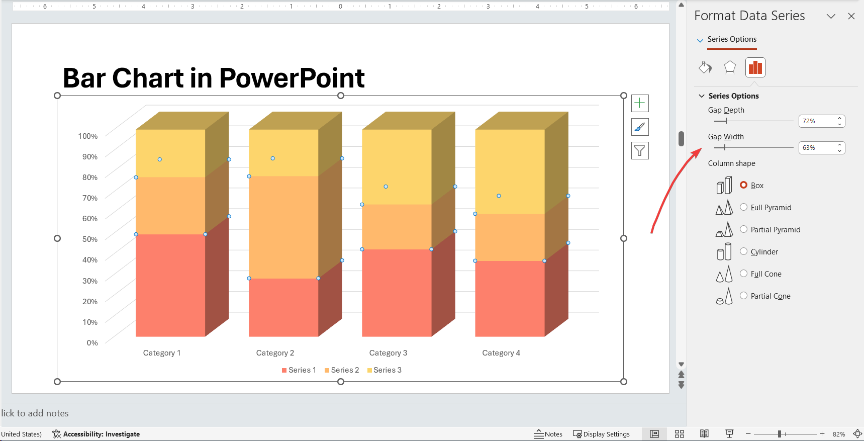
Actually yo change the bar width used in a PowerPoint chart you change the gap width (the space between one bar and the next one).

First, you need to right click over the bar and click Format Data Series, this will open a new dialog box with the data series options. Now look for Series Options and then change the Gap Width value. If you want to remove the gap between bars in a chart, you can choose No Gap or 0 value. This is especially useful when you want to make histograms using PowerPoint.
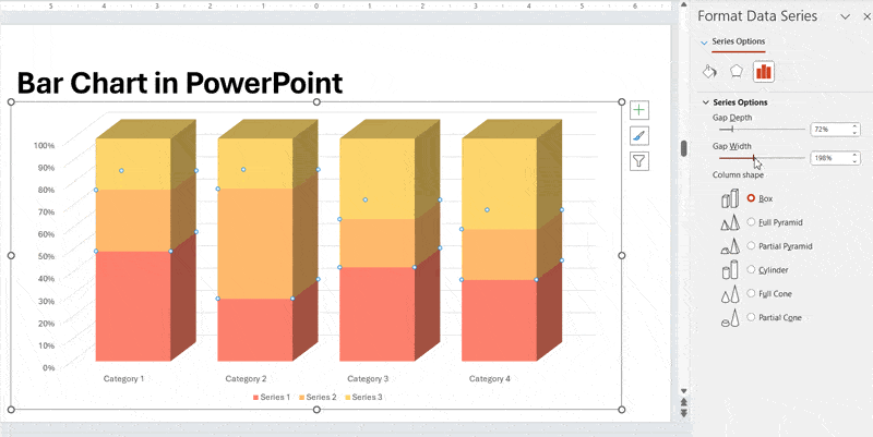
Example of data chart in PowerPoint without spacing in between bars
The figure above shows an example of PowerPoint chart with 100% bar width for each serie or no gap. So, you can easily change the bar width in a PowerPoint chart by adjusting the gap settings.
Alternatively, you can learn other quick tips to work with PowerPoint charts like how to change the border width in a PowerPoint chart or create awesome bar charts using Microsoft PowerPoint as well as combining different chart types.