How To Make Better Business Decisions Using Excel 2016 Charts
Decision-making is one of the trickiest parts of running a business. One wrong move and you can send your company down the drain or risk your brand’s image. When it comes to running a company or a business, you are not only thinking and deciding for yourself. You’re also deciding for your whole organization. You hold in your hand the future of your organization as well as the livelihood of your employees. This is why it’s important to explore and evaluate all possible solutions before making a decision. Let’s take a look at how Excel 2016 charts can help you make better business decisions.
Make the Best Decisions Using New Excel 2016 Charts
While the burden of decision-making can seem to really weigh on you, you don’t really have to make it all by yourself or pull magic out of a hat. Microsoft Excel have long been offering useful and reliable analysis and decision-making tools for many kinds of businesses to direct their company to their goals.
With the unraveling of Excel 2016 comes a further addition of new charts to help business owners and executives to make the right decision for their business. These new Excel 2016 charts include the new Histogram, Waterfall, Box and Whisker, Treemap, Pareto, and Sunburst. These charts allow you a wider range of visuals to choose from so you can better visualize any scenario. Doing so can also help simplify what could initially be complex situations.
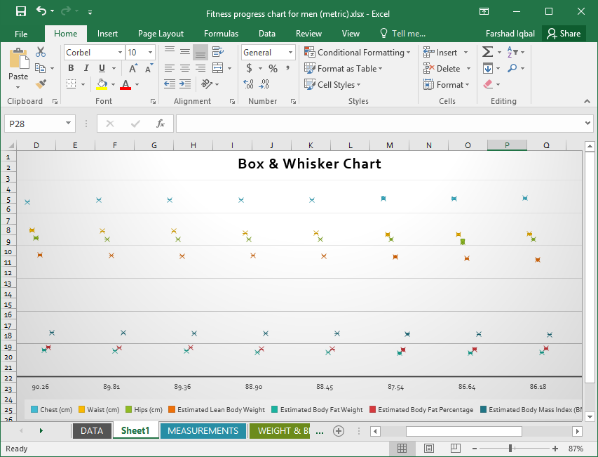
Use Waterfall Charts for Financial Statements
There are many scenarios that you may find yourself in at many points in your business’s lifespan. Before you even start your company, there are crucial decisions that have to be made. You are better equipped at getting to the root of any problem, finding out possible outcomes, ruling out bad decisions, and honing in on what’s best for your company with the help of charts.
For example, if you want to gain more insight into your finances, you can use the waterfall chart so you can easily see how each item in your financial statement is going. A waterfall chart is like a bar chart, and it indicates the values of your line items. It also uses color-coding schemes that you can customize with a set of colors that matches your brand, for example. The color coding indicates movement of your line items, whether they have increased or decreased, or you can use Excel’s formula and functions to match whatever you want to reflect in your waterfall chart.
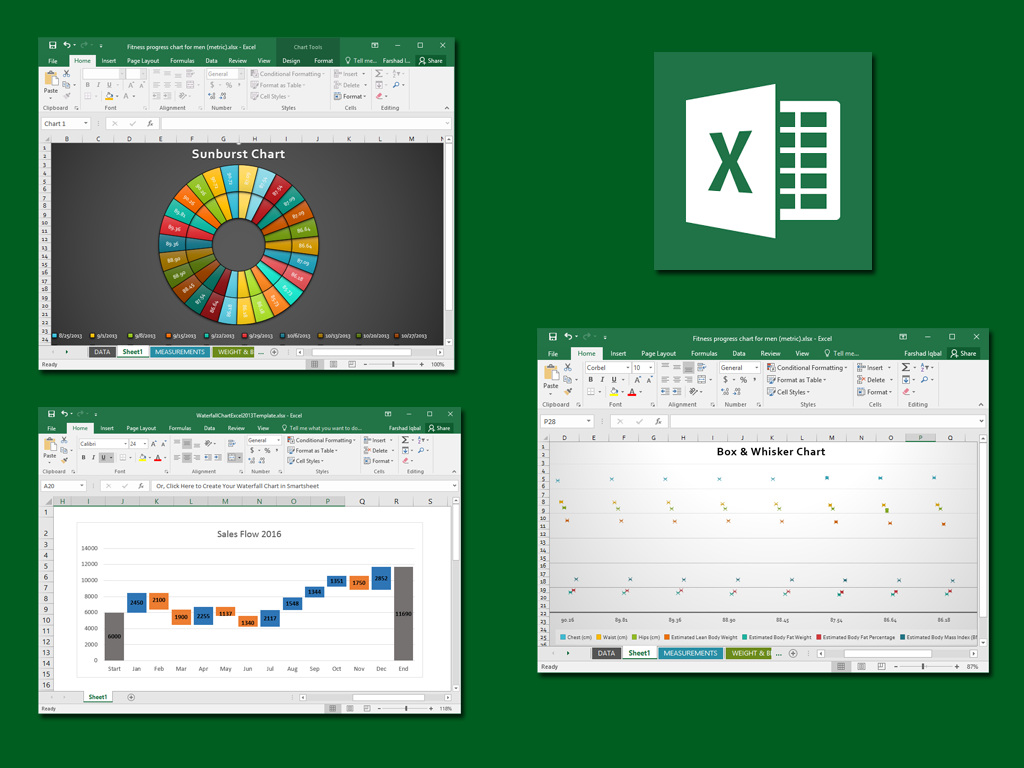
Show Relationships Between Data with Sunburst Charts
If you want to show relationships, you can go beyond a simple pie chart. Excel has a new chart, which is the Sunburst chart. It is a vivid and effective visual that allows you to display segments within a whole, which one has more impact, and how each one relates with the rest of the whole.
For example, you can use the Sunburst chart to show the different factors that affect your company’s sales revenue. You can list your product items and show them in your Sunburst chart. Each category can be color-coded into distinct segments, and each category can have numerous subcategories that you can easily distinguish in the sunburst chart, unlike in a regular pie chart.

Illustrate Statistical Data using Box & Whisker Charts
Attracting new customers is essential for the survival of most, if not all businesses. This is why the use of a histogram can be quite handy for business analysis for identifying key segments. However, another very useful chart you can use in Excel 2016 is the Box & Whisker chart. This chart can be used for a deeper analysis of available information. This might include data distribution in quartiles, mean, range, etc.
Excel 2016 charts, in addition to the charts that you’re already familiar with in the earlier versions, can definitely provide an easy way for you to visualize large amounts and varying kinds of data.
You will not be overwhelmed or intimidated by the new charts as they are more like improved versions or variations on the basic charts. They also function the same way, so you won’t have a hard time finding your way around, especially if you want to customize and embed the charts into presentations and reports.
You can change various components of the charts as well as add animations to make them pop out in PowerPoint presentations. With these Excel 2016 charts, you can display your data in a way that not only is attractive but also functional so you can determine trends, patterns, and even forecast future outcomes.