Presentation Tips from Data Visualization Guru Edward Tufte
Last updated on October 4th, 2024
Methodologies can often be complex and much of the core concept can often get lost in translation. Data visualization aims to bridge this gap by adding substance to the methodology. And arguably, none explains it better than Edward Tufte!
Who is Edward Tufte?
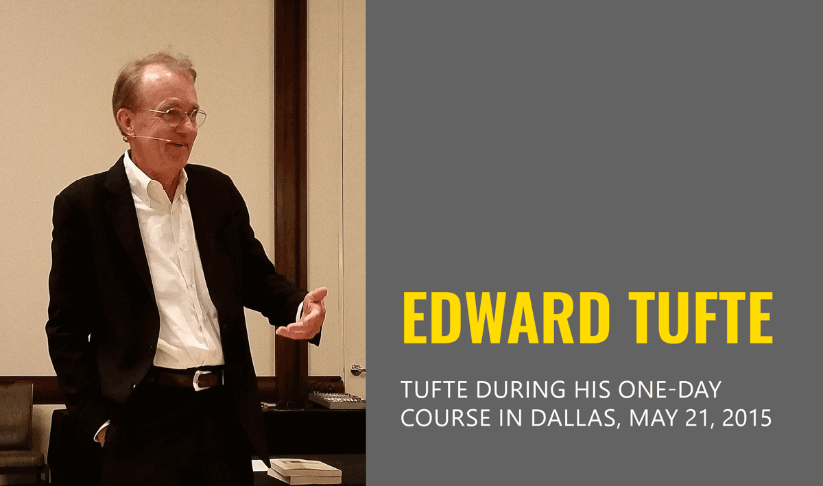
Edward Tufte, sometimes known as ET, is known for his simplified data visualization principles that enable the viewer to think about not merely the methodology, but the substance associated with the findings. He is an American statistician, with expertise in statistics, computer science, and political science. He is known for four books that he published on data visualization. He is best known for his remarkable insights on statistical evidence and its association with scientific visualization.
Edward Tufte’s Contribution to Simplified Data Visualization
Tufte’s writings have had an impact in information design and the field of visual communication of information, known as visual literacy. He coined several terms like chart junk and data-ink ratio to emphasize the need for reducing decoration to make visual content simple and easy to grasp.
One of Edward’s books, The Visual Display of Quantitative Information (check it here), provides 250 illustrations for the best and worst examples of statistical visualizations. The book provides a detailed analysis of how-to best display data for a precise and effective analysis without consuming too much time.
In another book titled, Beautiful Evidence, Mr. Tufte Identifies methods for effectively showing information suggesting new designs like sparklines, as well as chapters on diagnostic evidence corruption, and a move away from pixels and paper into thinking in ‘space land’. Tufte explores ideas associated with questioning everything in his book Seeing with Fresh Eyes: Meaning, Space, Data, and Truth. The book discusses typography, redesigning sentences, labels, images, and other essential aspects of visual design and the way they are presented.
Arguments Against Edward Tufte
Edward Rolf Tufte has been criticized for his views against pie charts. Critics of his views believe that pie charts not always about showing precise statistics but sometimes an idea of trends and an approximate estimate is sufficient and can act as a viable form of data visualization. Furthermore, there is an argument against bar charts that tend to be boring as compared to be rounded pie charts. Hence, criticizing Edward’s argument against pie charts, since he favored bar charts instead for more accuracy.
How to Incorporate Edward Tufte’s Ideas in Presentations?
In an essay titled, The Cognitive Style of PowerPoint (see more here), Tufte presented various arguments against how PowerPoint is used. He criticized PowerPoint presentations, criticizing how NASA engineers used PowerPoint, leading to the disaster of the Space Shuttle Columbia.
While Tufte makes many arguments against PowerPoint in his article, ranging from the poor typography and oversimplified charts to linear progression, there are a few ways you can improve your presentations by incorporating Tufte’s ideas, regardless of whether you’re using PowerPoint or another method to present information.
Evidence can be Presented in Both Words and Graphs
Tufte argues that it doesn’t matter whether information is presented in words or graphs. We must use the method that best presents the information. The design should be content oriented and useful for the user rather than focus on what modes to use to present it.
Fewer Details are Easier to Remember
It has been proven through research that people find it hard to remember more than seven things in short-term memory. Tufte argues this has also been translated into visual design. Keeping your set of information focused on fewer things can help you create a better presentation. In this case, you might also want to look into the principle of recency and the rule of three.
Sparklines can Help Break the Recency Bias
Edward Tufte is an advocate of using sparklines for showing large amounts of data in a readable fashion. He also believes that this can help overcome the recency bias and make large amount of information palatable, as a sparkline is as big as a word. To put it in perspective, sparklines can show as many as 50,000 win-loss outcomes for a baseball match. making it as an effective visual tool for showing data in a meaningful way.
Focus on Revealing Your Findings
Tufte argues that the capability of the human eye surpasses what PowerPoint can offer and visual displays still need a long way to go. He argues that instead of showing off data, space should be used in a smart way by showcasing more information in less space in an engaging manner that makes the viewer think about the findings. Hence, focusing on revealing the findings rather than focusing on a confusing process is an essential way of presenting information.
Avoid Threats to Visualization
Tufte warns to watch out for what he calls threats to visualization. He believes that unless you are in the field, you will not be able to measure how data is collected. Not knowing this can result in not knowing the actual context. Cherry picking evidence can affect how data is measured and presented, questioning its accuracy. Is your data a product of information or selection? The data visualization you are developing should be free of selection and must present evidence of your content not being biased, such as by using an external review or observer.
Harness a Sense of Relevance
One of the skills worth working on to present data in the best possible way is to harness a sense of relevance. Tufte emphasizes trying to find relevance from within complex information. Tufte believes it is a wonderful sense to develop to effectively present information.
The data to Ink ratio refers to the concept of optimizing the amount of ink utilized to represent data as opposed to the quantity of ink devoted to the presentation of the visualization itself.
Ideal visuals ought to be comprised solely of data-Ink. Eliminate Non-Data-Ink wherever feasible to prevent unnecessary distractions during the data presentation. The idea is to avert the viewer’s focus from inconsequential components.
Chartjunk is a term that encompasses any unnecessary or distracting visual components in graphs and charts that hinder the understanding of the data being displayed or draw attention away from it.
The goal is to design a display with the highest possible data-ink ratio (that is, as close to the total of 1.0), without eliminating something that is necessary for effective communication.
Final Thoughts
Edward Tufte questions many basic design methods by focusing on how people can be made to think about the findings, without presenting an unnecessarily cramped visual presentation of information. Tufte argues questioning conventional design concepts by focusing on what might be the best possible mode of revealing information and engaging viewers to make them think about the findings through visualizations.