You can use this technique of Squint Test in PowerPoint presentations to simplify your slide design but keeping the complexity of data.
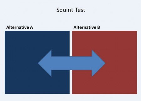
A good explanation of this can be found in the The Squint Test: Creating Simplicity of Design and Complexity of Data, from ExtremePresentation blog. As described here, the layout of your page or slide should communicate so the user can learn something without reading the full chunk of text. We can use the following slide design to let the users choose from two possible alternatives. On each side of the slide we can communicate the different options. In this case we have two options, but we can divide the slide in 4 sections if we had four options instead. Squinting at this page we can see that there are alternatives in opposition to one another.
The squint test simulates the very first thing to hit your brain when you see a new page or slide. If the very first thing you see introduces the main point of the page to you, then the rest of the communication will flow easily.
We recommend to read the full original article from Extreme Presentations to see other examples and how you can apply the squint test to your PowerPoint presentations.
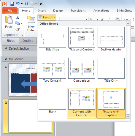
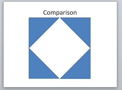
If you want to play with the layout you can refer to the article where we explained how to change the PowerPoint layout easily using PowerPoint. There is also a Comparison layout that was used for the example above. Here you can compare between two alternatives.
However, if you want to create a comparison of multiple alternatives, then you can also use shapes to create more blocks.
The Latest FPPT Templates Delivered To Your Inbox
We will send you our curated collections to your email weekly. No spam, promise!