How to Draw a Sine Wave in PowerPoint
Last updated on January 4th, 2025
If you need to draw a sinusoidal curve in PowerPoint for your presentations then here we will show different approaches that you can use depending on your needs.
A Sine Wave or Sinusoidal wave is a mathematical curve that describes a smooth repetitive oscillation. It is named after the function sine, which is the graph. According to Wikipedia, sine waves often occur in pure and applied mathematics, physics, engineering, signal processing, and many other fields, including sound engineering, structural engineering, music applications, the aerospace industry, electrical engineering, and more. For example, the oscillation of an undamped spring-mass system around the equilibrium is a sine wave that can be modeled in a sine way, or you can also model a pendulum oscillation.
1. Use a Fooplot to draw a perfect Sine Wave curve for PowerPoint
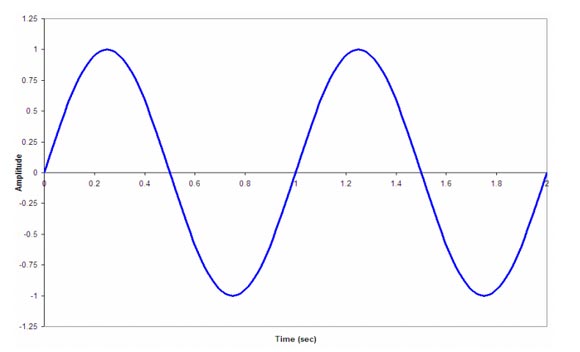
As we have seen, Fooplot is a useful online tool that allows us to create graphs and plot any function online. We can specify sin and cos and draw a nice sinusoidal curve for our PowerPoint presentations and other mathematical plots for presentations. You can also use this to make math functions PowerPoint templates to download.
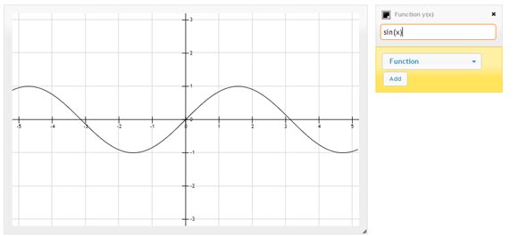
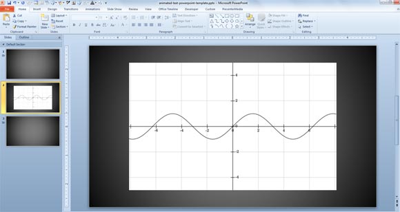
Then you can generate the output image as a PNG or any other format, and paste it in PowerPoint 2010. Below you can see an example of a PowerPoint slide showing the sin(x) function.
2. Plot a Sine Wave using Bezier Curves
Another approach to draw this kind of curves is using Bezier curves. However, the result you may get using these curves may not be perfect. Depending on your presentation needs, you may want to choose between making a Sine Curve using this approach or a more accurate approach like plotting the sine curve in Fooplot or Matlab.

Drawing a Sine Wave using Bezier Curves may not be very practical at a glance, and you’d need to edit the points to make it look more accurate. You can trace in PowerPoint using the tracing method that we explained below over the sin(x) plot created previously as an image. Then you can represent a simple sine wave curve like in the sample above.
3. Draw a Sine Wave in Excel and Paste it in PowerPoint
Another approach would be to draw the sinusoidal curve in Excel using the sin Excel function and then copy and paste the resulting graphic into the PowerPoint slide. Using this approach. To plot a sine wave in Excel you can use the instructions in this PDF. Basically what it suggest is to create a spreadsheet with the following information: Enter Frequency, Omega, Amplitude, and Delta t (sec.).
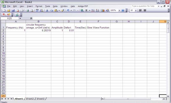
Then enter the initial time (in the example is zero) and fill the time column using hte equation t+1=t+delta. Now you can fill the values under Sine Wave function using the sin() function in Excel.
Finally, to draw a sine wave in PowerPoint, you can use the XY scatter plot to create the chart.
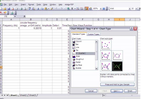
When you are ready, you can copy and paste the plot to the PowerPoint presentation.
Now that you learned how to draw a sine curve, you can learn how to draw smooth curves in PowerPoint or a wavy line in PowerPoint using shapes.
Love it