Find The Break Point To Create Responsive Designs With ResponsivePX
ResponsivePX is a web app which facilitates developers in the development of responsive web designs. The main purpose of ResponsivePX is to to adjust the width and height of a viewport so that one can find the exact breakpoint width. The information gathered using this service can then be used in media queries to create a responsive design. ResponsivePX provides a simulation for your local or online website to help you identify the exact breakpoint widths. This can be done by entering a URL and using the scrollbars for adjustments. After your adjustments are complete, you can even share the simulation with a fellow programmer.
Find Tricky Breakpoints In Just A Few Clicks
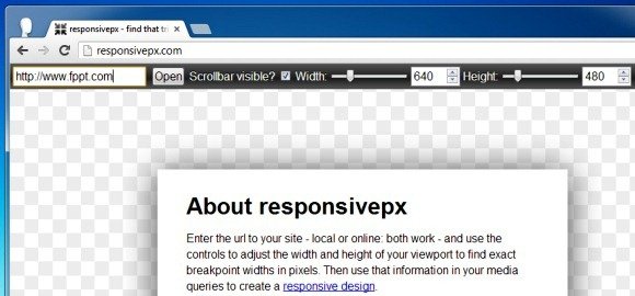
To get started, enter a URL for a local or online website, select the current width (if required) and click Open. Make sure you check the Scrollbar Visible checkbox to get the accurate viewport width and height.
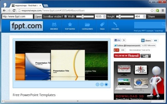
This will open the website simulation where you can adjust the Width and Height of the website to find the desired breakpoint. There are three basic options for using this simple web app, i.e. the Width and Height scrollbars and the Share button. As you make adjustments, the URL constantly updates and can be shared online. This might help you get much needed advice from a fellow programmer or enable you to get back to adjustments later on. Clicking on the Share button opens your default mail client with the sharing URL.
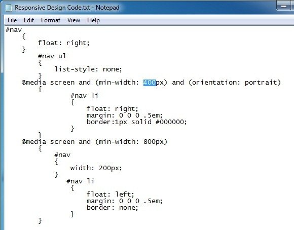
Once you have identified the exact breakpoint widths in pixels, you can make adjustments to your media queries to create a responsive design.
ResponsivePX Demo
To see a demonstration about the usage of the ResponsivePX web app, see the developer’s video given below. This video will walk you through the entire process for making adjustments using the ResponsivePX web app.
ResponsivePX is a free web app and very easy to use, it shouldn’t take you long in grasping the concept for using it.
Go to ResponsivePX