Drawing a Simple 3D Chart in PowerPoint using Shapes
Last updated on December 26th, 2024
Charts play an essential role in displaying data in a way that’s easy to understand. With the advent of 3D charts, your presentations can now gain a new dimension, literally. 3D charts not only add depth and perspective but also make your presentations more visually appealing, making them an effective way to impress your CEO and the top management. In this tutorial, we will explore how to create simple yet impressive 3D charts using shapes and 3D effects in PowerPoint.
How to Make a 3D Column Chart in PowerPoint using Shapes and 3D effects with Perspective
Before creating your 3D chart, it’s important to determine the type of chart you need. Simple 3D charts can efficiently represent uncomplicated data sets and are easy to create. They are ideal when you want to present a straightforward idea or a concept without much fuss. However, for more complex datasets, you might need to resort to PowerPoint’s built-in chart tool, which allows for intricate data representation. Always remember that the type of chart you choose should reflect your data effectively.
In this section, we will see how to create a basic 3D chart in PowerPoint using shapes.
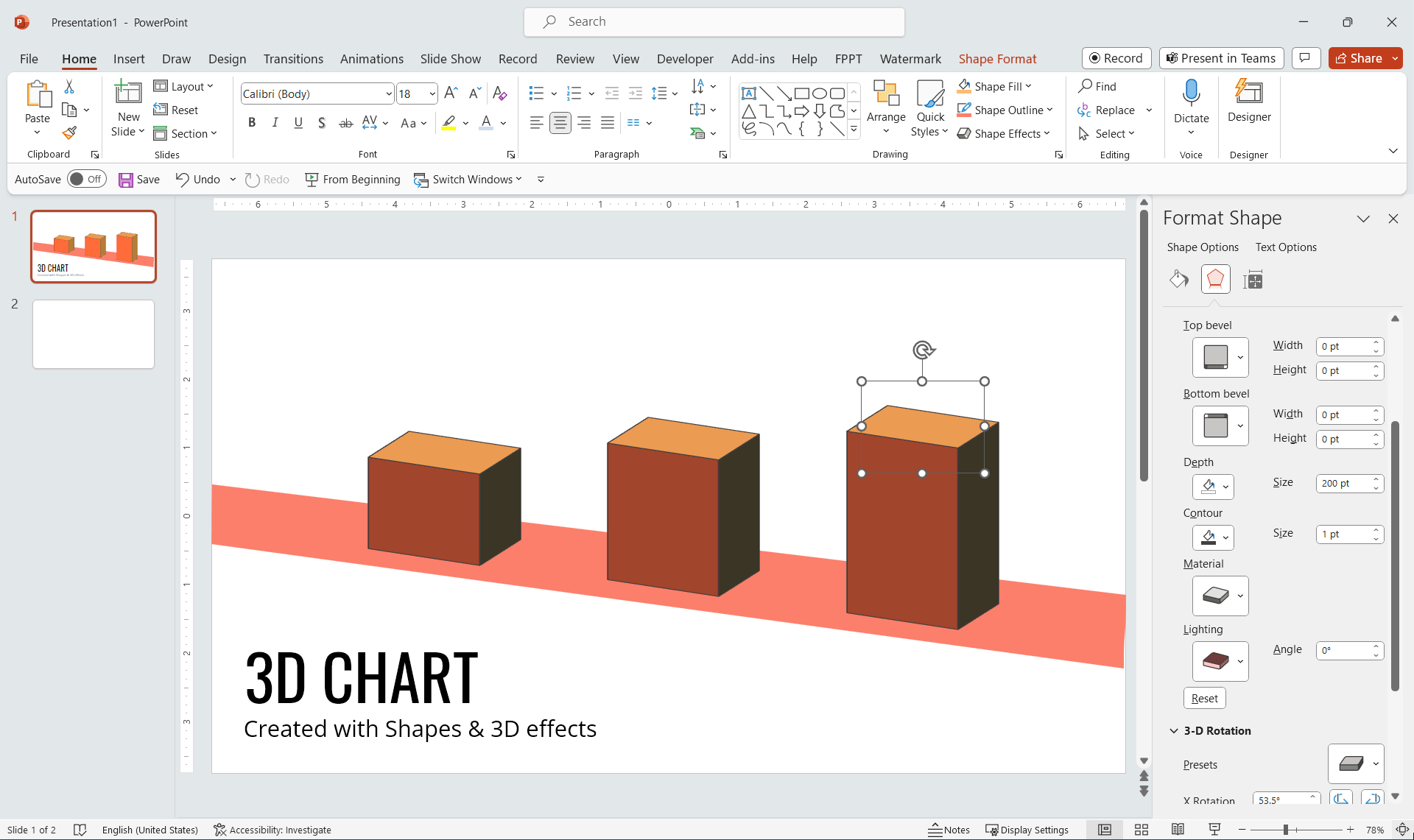
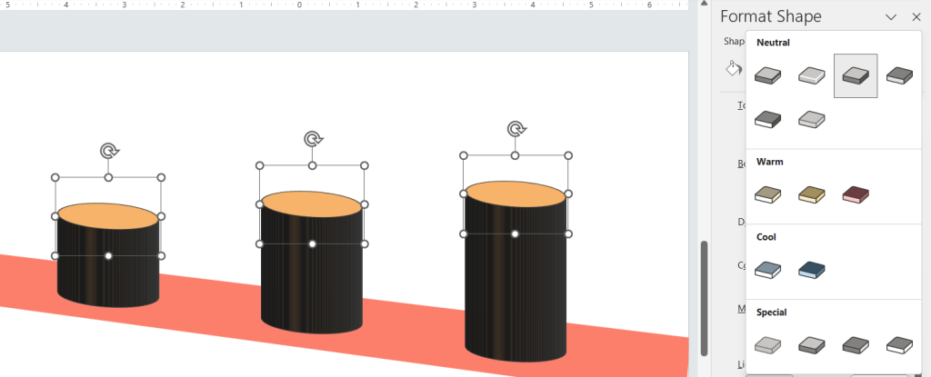
How to make 3D chart in PowerPoint? First, we start adding a simple shape. You can choose a rounded rectangle or any other shape. You can insert the shape in PowerPoint and then access the Format Shape options to add a 3D or perspective effect. To access Format Shapes, you can right-click over the shape and then click the Format Shape option.
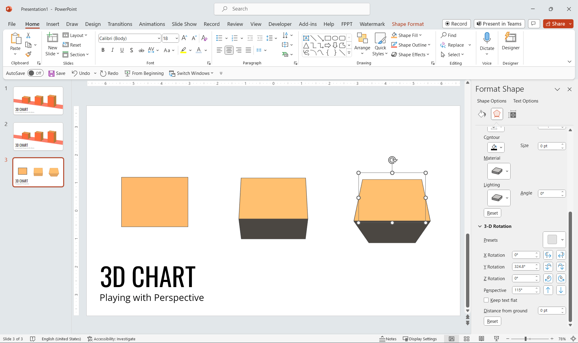
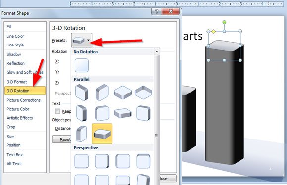
Now, add a 3D rotation option, you can choose it from the preset under 3D rotation tab. This will help to add a 3D style and deepth value, but then you’d need to enter a depth value. For this example we have used 100, 200 and 400 as depth but you can try different values depending on the 3D chart that you want to build.
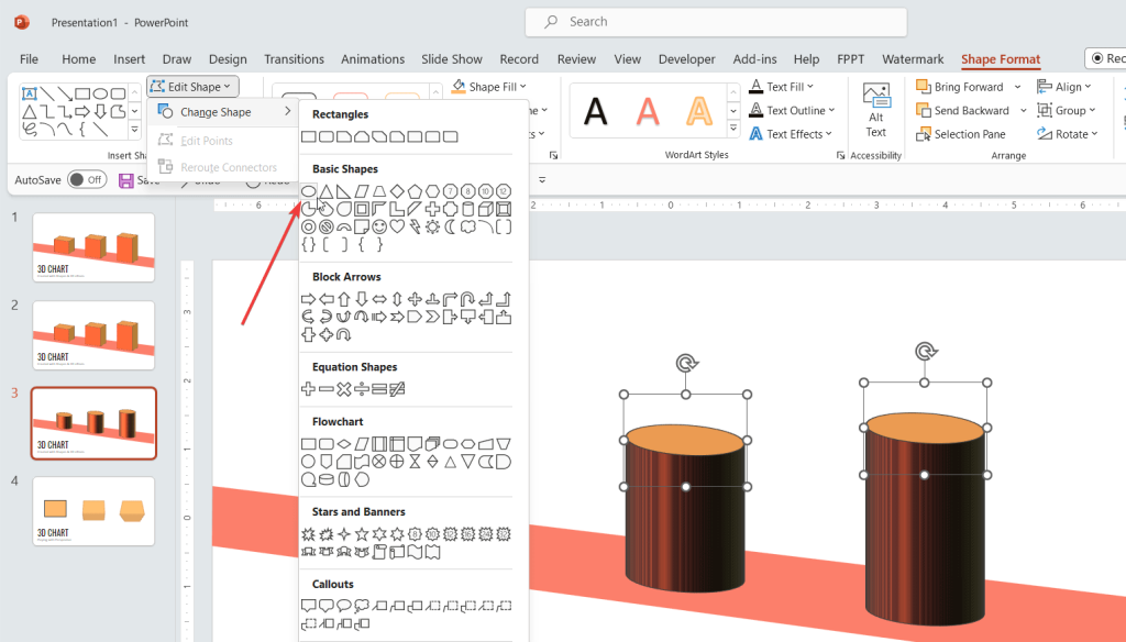
Finally, if you want to try with different shapes, just go to Format and then Edit Shape to use a circle for example.
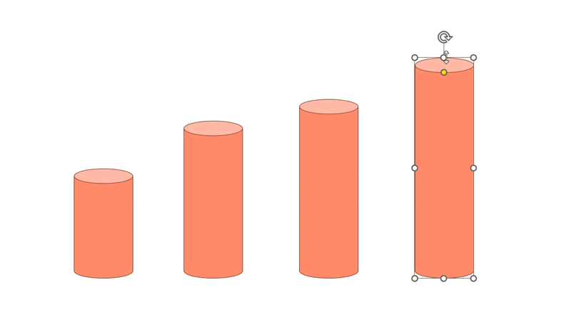
This is an example of 3D chart that we have created with this simple technique.
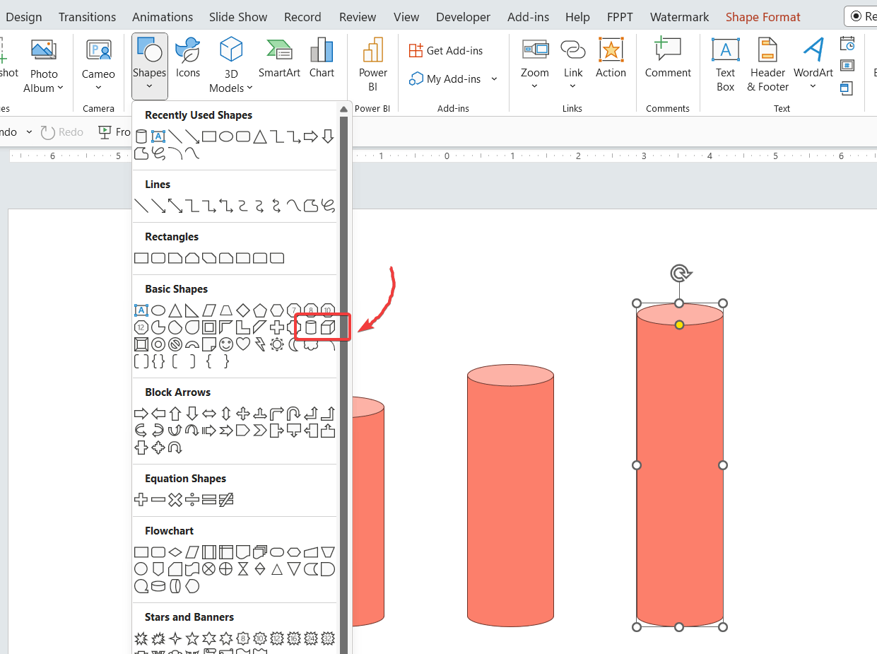
Using Cylinder Shape to Create a 3D Chart in PowerPoint
You can use a different approach. For example, picking the cylinder or can shape in PowerPoint, which has a simple 3D style that you can use without changing the format options. We have created this other 3D Chart with simple can shapes in a new slide. Let’s see how to draw 3d shapes in PowerPoint.
3D charts can help decorate your business presentations orvisualize data in your slides.
After inserting the shape, you can adjust its size and dimensions to reflect your data points. Remember, your shapes will act as visual representations of your data, so adjust them appropriately.
To make your charts more engaging, consider adding animations, custom color schemes, or highlighting important data points. Remember, the goal is to communicate data effectively, so don’t go overboard with the effects.
One common mistake while inserting 3D charts in PowerPoint is using too many effects, which can make the chart confusing. Keep your charts simple and focused. Also, always check your data for accuracy before creating the chart, as errors in data will lead to a misleading chart.
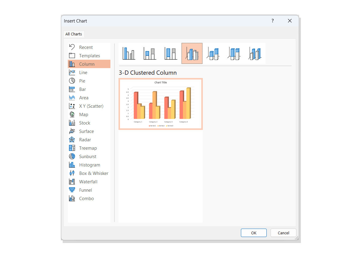
Another way to insert 3D charts is using the PowerPoint’s built-in chart feature. Not all the chart types are available in 3D but you can easily insert 3D bar charts and 3D pie charts using this approach.
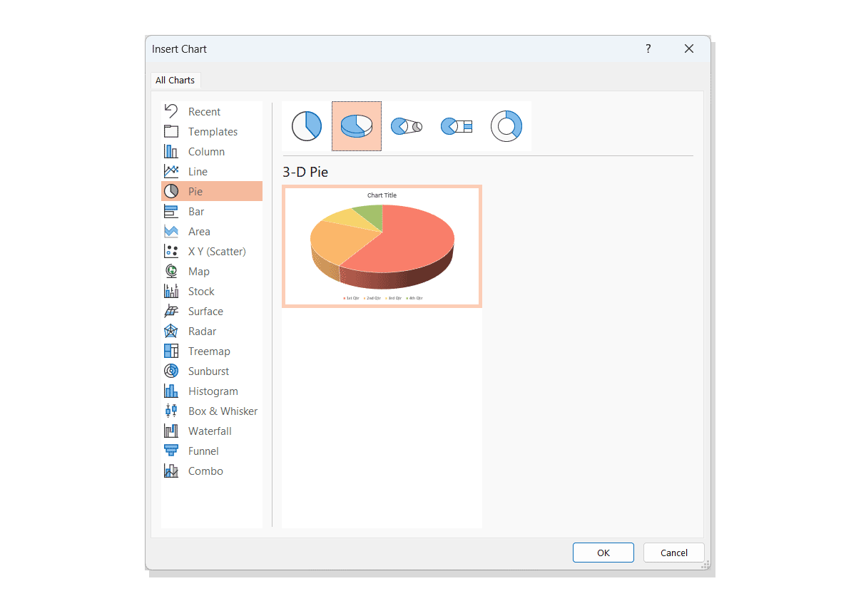
You can also insert a 3D Clustered column chart in PowerPoint using this method.
Finally, another way to insert 3D charts in PowerPoint is by first creating it in Excel and then use Copy and Paste to copy the chart to PowerPoint. You can learn more about creating a chart in Excel in our article how to make a 3D Bar Graph in Excel.
Conclusions
Creating 3D charts in PowerPoint is a great way to add depth and visual interest to your presentations. With practice, you can easily make impressive charts that accurately represent your data and leave a lasting impression on your audience.