Advertisement
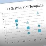
Polychart: Create Awesome Charts For PowerPoint Using Your Own Data
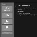
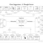
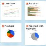
Data visualization tools are one of the most effective ways of conveying long and otherwise daunting information to your audience. Charts and graphs are common ways of displaying information and unlike text and figures, they do not scare the audience.