Learn how to best use a scatter plot graph, especially with the aid of PowerPoint. Find out about the best ways of making a scatter plot diagram for your PowerPoint presentations, using simple techniques that can help give your graph a professional look.
You can also download scatter plot templates for PowerPoint and Excel that can be conveniently edited and incorporated in your presentations and official reports.
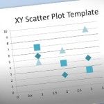
Scatter plots are a type of graph used to show the trending of some sort of data and the system’s variance. This type of presentation comes handy when you need to show your customers how good (or bad) the trend is for any sort of topic: assays, experiments, revenues, sales, etc. The chart is widely …
In PowerPoint we can create diagrams and charts easily with a few clicks thanks to some of the built-in features for this purpose. For example, we can insert a chart into a PowerPoint slide or use SmartArt to make awesome graphics. XY (Scatter) chart plot two groups of numbers as one series of X and Y …
Advertisement
The Latest FPPT Templates Delivered To Your Inbox
We will send you our curated collections to your email weekly. No spam, promise!