Supply & Demand Chart for PowerPoint
In PowerPoint you can insert diagrams and charts easily but sometimes you need some generic diagrams or business charts for your presentations.
Instead of creating the data-driven charts with real data from your spreadsheets, you can just draw a chart using shapes which will be enough in some cases to denote and present an idea, concept or topic.
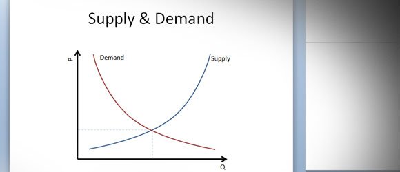
Supply and demand is an economic model of price determination in a market. It concludes that in a competitive market, the unit price for a particular good will vary until it settles at a point where the quantity demanded by consumers (at current price) will equal the quantity supplied by producers (at current price), resulting in an economic equilibrium of price and quantity.
How to Draw a Supply & Demand Chart in PowerPoint
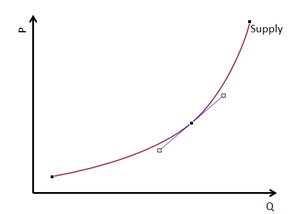
You can start adding the supply curve. For this case, we will use a curved line in PowerPoint using shapes.
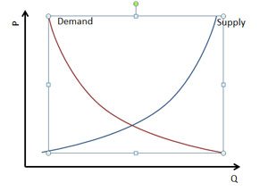
Now you can select the shape and flip horizontally. This will help to create a mirror shape for demand curve.
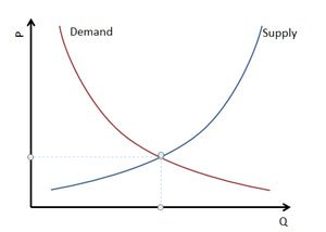
Finally, you can intersect the demand and supply curves with dotted lines in PowerPoint.
This can be really helpful to make marketing diagrams or business charts in PowerPoint.