How to make a simple Cluster Analysis Diagram in PowerPoint
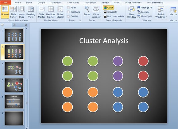
Cluster Analysis is a widely adopted technique in Data Mining field. There are many different charts and graphics that you can use for data mining and cluster analysis but if you need to get some visualization ideas for your PowerPoint PPT presentations then this template may be useful. We have used shapes to draw circles in the slide and changing the size of the shape you can represent the cluster groups.

This cluster diagram example is very basic but tweaking the shape color and size and using connectors you can get a nice visualization tool for your presentations. With a dark background color like this example and plain basic colors in the shapes with a white border, your final PPT can look better. Of course, you will need to adapt this approach to your own data and find a way to separate the groups for example using Excel Data Mining tools. You can download cluster PowerPoint templates for your presentations.
This video will explain step by step how we achieved the previous results in PowerPoint 2010.
Alternatively you can download clustering PowerPoint templates and backgrounds for PowerPoint 2010 and 2007.