How to Choose the Right Font for a Presentation
And you thought making a presentation was tough work? Well, you are mistaken because making a presentation is easy, especially now that you can choose from and download so many different templates from the internet!
What every respectable PowerPoint using person on the face of this planet should be doing is to pay homage to the man who invented templates! Because without him, you and me would still be sulking in the corner of the room trying desperately to figure out some tips and hacks of PowerPoint! But since that isn’t the case, we can take the easy way out and download so many different templates for free on the internet!
But downloading templates is easy, writing a presentation script isn’t! And choosing the right font for your presentation can get seriously tricky. There’s a massive chance you can ruin your presentation because of the font. But fret not, because pretty soon, you’ll get to know how to choose the perfect font for any presentation. While making the right decision, here are other points to consider when picking the right font for your presentations.
Topic of Your Presentation
The first and the most important factor for choosing a font is your presentation! Yup, that’s right! Before you start typing away furiously, take a moment and think about what your presentation is about and where are you going to present it! This is important because you don’t want to be that guy who used ‘Comic Sans MS’ for an official presentation because you sure won’t be able to shake away that name!
Whether to Use Display or Content Font?
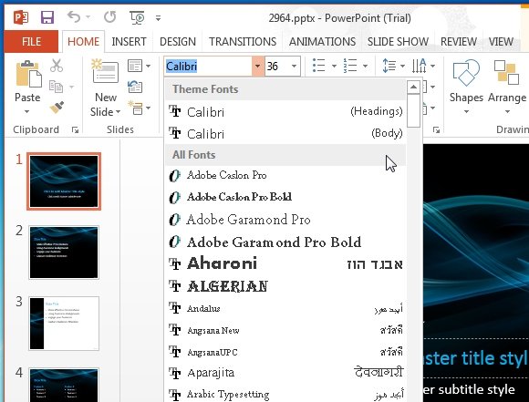
Now, primarily there are two types of fonts, display and content font. And as the name suggests display fonts are meant to be catchy and showy! They are used in presentations where there is little to be read and the main motive is just to catch the attention of your audience. Whereas, content fonts are used where there is information to be presented which your audience has to read. These are simple fonts which make it easy to read the information presented.
Don’t Choose Overused Fonts
By overused fonts it is meant that don’t go for those boring ‘Ariel’ and ‘Helvetica’ that everyone seems to be using! Try to incorporate some new fonts but without compromising on your presentation. So that means choose a font related to your presentation, if it’s informal then any nice looking font will do but if the tone is formal then you need a clear font which won’t be difficult for your audience to read also.