Simple Graphs

Learn how to make simple graphs in PowerPoint. These posts contain tips and templates that can help you in making PowerPoint charts and graphs.

You can make use of the editable templates given below, as well as learn from the easy to follow tutorials to create better graphs with attractive designs to impress your audience.

How to Add a Trendline Chart in PowerPoint

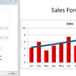
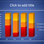
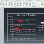
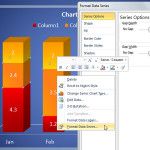
Trends can help to visualize the big picture while looking at a 12-months sales chart or Year-to-Date chart in accounting or financial PowerPoint presentations, but other sectors or topics of interest will also benefit from trends. How to show trends in powerpoint? In PowerPoint (and also in Microsoft Excel) you can add trendlines to your charts, …

Chart Analysis Tools in PowerPoint 2010

Chart analysis is good to use in mainly showing the distance between high and low points as well as make predictions on increase and decreasing values over a period. In this tutorial we’ll explore what the Analysis Tools in PowerPoint’s Chart Tools section does. To start you will need a 2D bar or line chart. …