Using J-Curve in PowerPoint Presentations
In order to illustrate a turnaround, a J-Curve can be effectively used in every field of study. It actually refers to a diagram that first shows an initial decrease and then a fast increase in whatsoever is being evaluated. This term is also known as J-Curve Effect which may be used to elucidate the losses and profits in a private equity firm.
No doubt, this term plays a vital role in the effectiveness of policies that are designed to progress the balance of payments. Nowadays, it has been rightly said that this tool is actually an innovative way to understand why countries fall and rise. Since, it gives a clear picture about the status of a nation and tells clearly about the stability and volatility aspect.
Why J-Curve is so important In Today’s World?
There are some great uses of J-Curve in several private equity and economic funding scenarios. Take a look at some of the advantages of this effect:
J-Curve in Currency Value
The value of currency diminishes, when the country’s trade value drops. Here is a J-Curve effect can be used, on the diagram loss in currency value is expressed by a curve or drip and so the populace start buying local products over the imported ones. Further on, it leads to monetary gain for the nation.
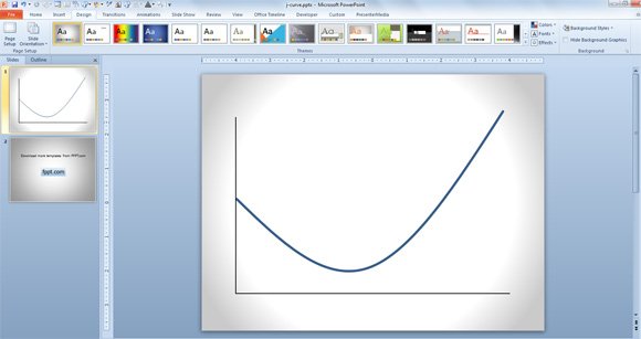
J-Curve diagram for PowerPoint
The several curves on the diagram clearly represent the losses and profits of an entity and country. Above the starting point, the curve shows the effect of fall of a currency and then after a period of time retrieve the above footing that signifies the J letter. In PowerPoint you can easily create a J Curve by using the curved line. Alternatively you can learn how to use Bezier curves in PowerPoint.
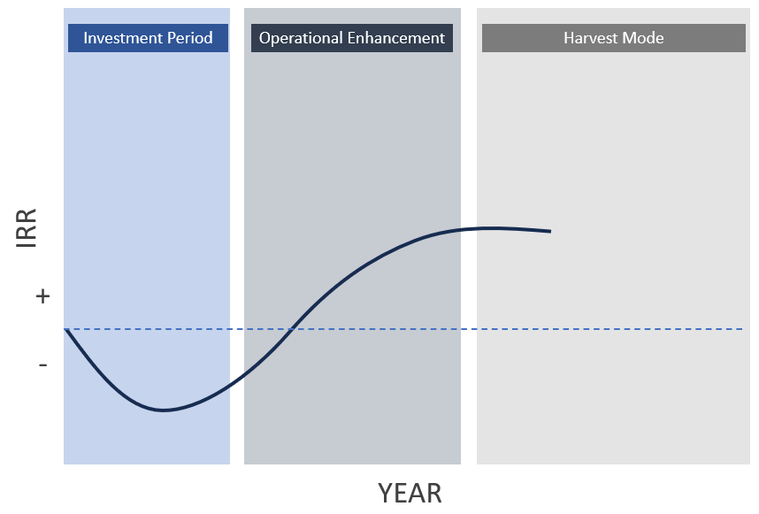
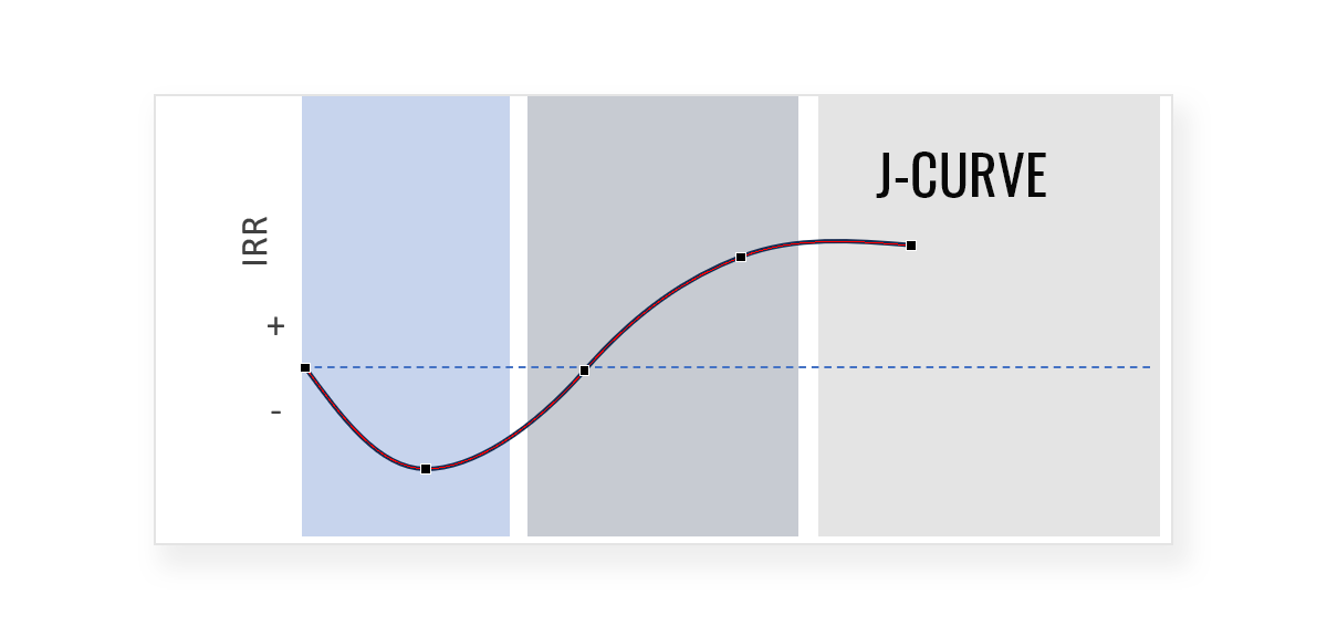
J-Curve in Private Equity Funds
The private equity funds that are not managed well or badly monitored accounts do not really experience the positive phenomenon. On the other hand, when they are supervised well, ends up experiencing the big J-Curve that shows positive returns. If you see a investment chart showing investments along the time then the norm is that the early investments produces some loss of funds while it is expected on the right of the chart to see profits.
J-Curve in Economics
In an economic field, the gain is mainly represented by an upright line and the loss of funds shows by the curve that dips below the initial stage. Thus, the new policies and investments represent loss of funds succeeded by substantial profit.
To design a J-Curve in PowerPoint, you can use the Curve shape. In the following example we show how we created this J-curve for a private equity presentation.
You can read more on presentation tips to get sponsorship.
The mentioned above are just some of the areas it covers. It covers the diverse fields such as: medicine, balance of trade model and many more. In today’s modern age, it has been used widely as several organizations have found it quite beneficial and unavoidable.