PowerPoint Diagram For Levels Of Measurement In Marketing Research
Marketing research is a tedious job especially if you are presented with the task of data gathering and information. Fortunately, you can use SmartArt graphics to present the different levels of measurement or measurement scales for data gathering. For example, in the previous article Using Bending Picture Accent List SmartArt in PowerPoint Presentations, SmartArt graphic was used to present the different measurement scales, (see graphics below).
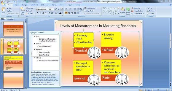
The SmartArt Bending Picture Accent List was used to present non-sequential information or data in no specific order since each block could stand alone. You can also add images in the circular portion of the graphic to visually aid the presentation for better understanding. More so, you can input 2 levels of text wherein the small shaded portion could serve as the title while the wider shaded portion, upper side, could serve as the area where you can input the details or definition of the said title.
Using the said graphic in PowerPoint could help you present at-a-glance the different scales, its features and differences. Needless to say, the graphics will help you easily discuss and explain complex ideas, especially on how each scale is implemented.
Other SmartArt Graphics You Can Use To Present Levels of Measurement
Since each measurement scale is approached differently and needless to say, it yields different results too, you can use different SmartArt in each scale. For example, you can use Vertical Bullet List to clearly explain Nominal Scale, (as shown below).
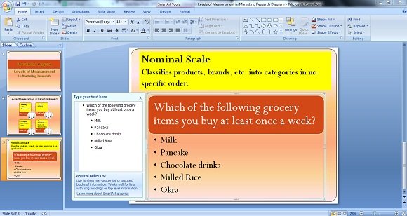
Since the nominal scale only classifies products, brands, etc., it will give you information of the usual items, brands, products or companies that a customer usually supports, buys or patronizes. For example, the graphic shown above posts the question on the grocery items that a person usually buys at least once a week. The information or data will be limited to the choices presented in questionnaire, hence data interpretation could look something like:
“Out of 100 respondents (assuming that your research involved 100 respondents in one week),
70% or 70 respondents answered Milk while 15% answered Pancake,
10% Chocolate drinks, 5% Milled rice while none for Okra.”
Use SmartArt Graphics Appropriate for Each Measurement Scale
You can also use the same SmartArt in presenting Ordinal Scale, like the one shown in the below image.
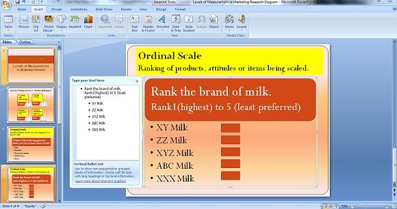
As mentioned earlier, each level of measurement is approached differently yet you can use the same SmartArt in your PowerPoint Presentation. With the example above, you can also use the Vertical Bullet List but since Ordinal Scale is for ranking products, attitudes, brands or items, then there should be a provision or space where your research respondent can place his/her answers. But since the said SmartArt doesn’t have the provision for ranking, what you can do is add or insert Shapes that you can find beside the SmartArt icon on the upper left side of PowerPoint.
Assuming that a result was gathered for the example (as shown above), the research interpretation using the Ordinal Scales would be as follows:
- 60 out of 100 respondents ranked ABC Milk as #1
- 20 out of 100 respondents ranked XXX Milk as #2
- 10 out of 100 respondents ranked XYZ Milk as #3
- 5 out of 100 respondents ranked ZZ Milk as #4
- 5 out of 100 respondents ranked XY Milk as #5
Of course, you can use other SmartArt graphics for your business presentation and research works since you will definitely find a suitable graphic that will suit your needs. Lastly, you can smartly use SmartArt graphics to present complex ideas as simple as possible.