How To Insert a Line Chart in Excel
Last updated on April 29th, 2024
In Microsoft Excel you can create charts easily using the built in chart feature. This article will show you how to create a simple line chart in Excel. First, we will use a simple table that have many different series, but for simplicity we will take one serie at a time.
One of our users contacted us and sent us an Excel spreadsheet with performance report that should be visualized in a chart to show the trend. So, we created a new chart based on the data series and then added a trend line to show the positive or negative trend.
You can use line graphs and charts to plot changes in data over time, such as monthly revenue and earnings changes or daily changes in stock market prices or advertising report.
In order to create a simple line chart in Excel we can first select the two columns used for x-axis and y-axis.
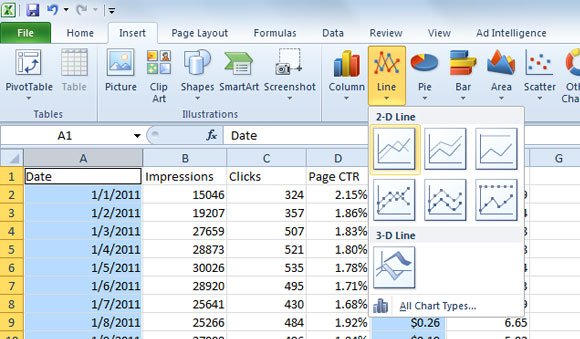
Then, loo at the Insert menu and then click on Line chart option. Here you will see a new popup with 3D and 2D charts.
Finally, the chart will appear in the spreadsheet and from now you can customize it.
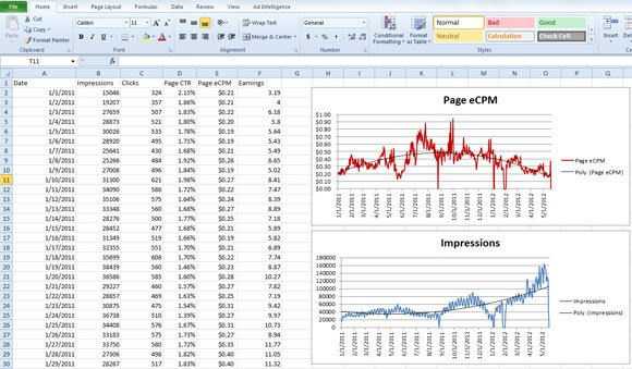
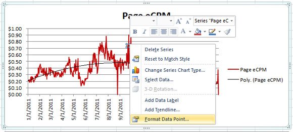
For example, if you want to customize the look and feel you can change the chart type but also the chart properties like line color, line style, etc.
This way, you can create simple charts in Excel and then embed these charts in PowerPoint easily. To insert this same chart in a PowerPoint slide we can Copy & Paste it in PowerPoint.

In this previous example we have used a very simple business plan PowerPoint template that we have listed for free in our presentation templates website and then pasted the simple line chart from the Excel spreadsheet.