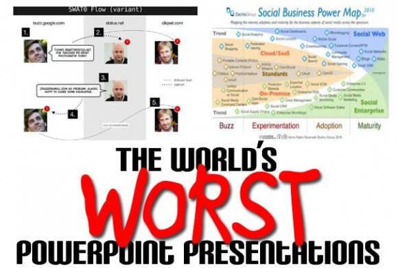
5 Top World’s Worst PowerPoint presentations
PCWorld recently published a content where people can vote what were the World’s Worst PowerPoint Presentations. Here we will summarize the top 5 worst PPT presentations and most voted ones. For this contest, the organizers got a few slides where people think that it’s okay to put 100 graphs on one single slide and the purpose of this contest is to let you learn from the presentation examples how not to make PowerPoint slides for your next big meeting or PowerPoint presentation.
The World’s Worst PowerPoint Presentation
Convoluted flow charts? Tacky, out-of-focus graphics? Huge blocks of text? Welcome to PowerPoint Hell.
The basic PowerPoint rules states that you should use a lot of bullet points but don’t overdo the text and avoid multimedia excesses. Many PowerPoint Guru may know about this but other people is still making bad PowerPoint presentations and these rules may not be obvious for other people. This persona of people include professors, teachers, buinessmen, etc.
1. Example mixing images and text in the same PowerPoint slide
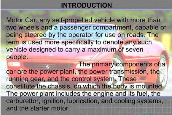
This PowerPoint slide on puts all of its images in the background as a watermark image but too confusing with the text in front of the slide. The Ferrari mix with text in front and paragraphs of text overlaid on them accomplishes the difficult feat of making the images hard to look at and the text hard to read.
Instead of this, you may want to separate the image to the left, top, bottom or right of the paragraphs. For example, you can take a quick look to Formula 1 PowerPoint template where the Ferrari was put in the right of the presentation title. Unless you explicitly need to put text inside the image, in this case you can see donate car PowerPoint template. Also, adding some bullet points and reduce the text length could also help to share the message and overall idea about this presentation slide.
2. Social Networking chart in PowerPoint – Social Business Power Map
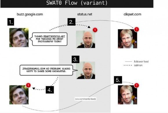
The flow chart presented here is simply baffling accordingly to the post review, and and the pictures don’t help much to share the message about what this chart means.
3. A Symmetrical Rainbow of Confusion
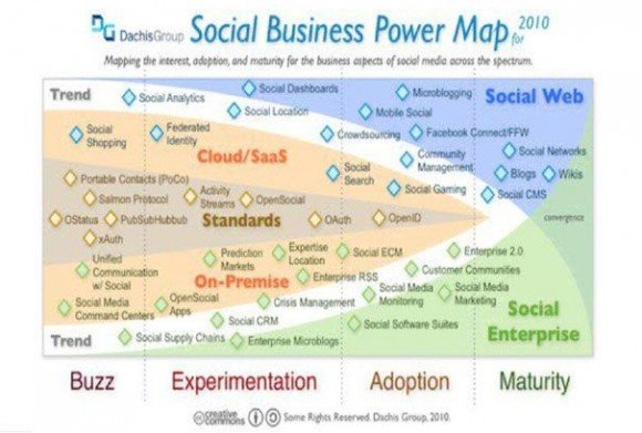
Clearly there are 4 main areas like Buzz, Experimentation, Adoption and Maturity, but what’s the difference between a one in a big black square and a one in a little red circle without a legend? Also, there is a mix of colors like the salmon, green, white and blue that is not so much clear in the Social Enterprise nad Social Web areas.
Colors are great for attracting an audience but six colors or seven colors can make this very difficult to understand without a proper legend. The colors in this “social business map” don’t clarify anything accordingly to the author of this review but, for example why are “Social Web” and “Social Enterprise” in different colors but “Cloud/SaaS” and “On-Premise” in the same color? Also, the whole chart looks like an alien Venn diagram, and the big labels along the bottom appear in random colors that correspond to nothing else on the chart.
4. Flow Chart on Steroids
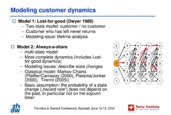
In this PowerPoint example the left side of the slide on customer lifetime value in service contracts does pretty well. The text is in short bullet points, colors and fonts are restrained, and the presenter used a basic slide template. The author of this review recommends to use a PowerPoint template. Also, there is a criticism about the chart in this image. Accordingly to the review, the flow chart with red arrows do not explain what is going on in the maze of black arrows. The red arrows looks helpful except for the jarring overlay of red on black.
5. Wireless PowerPoint – Executive Summary
In this wireless PowerPoint we can see a lot of text as part of the executive summary slide for this Wireless presentation. This sounds like an endless “Summary”, filling an entire PowerPoint slide with text is never a great idea
The author says that it is a bad idea to use an impenetrable slab of 10-point text to provide an executive summary of the ensuing presentation. It’s hard to imagine what useful thing the presenter thought this slide would accomplish. No one is going to want to read the text, and if the presenter does so, what’s left to say in the presentation? The most chilling part of this cautionary tale? The audience hasn’t even seen the entire “executive summary” yet–it continues on the next slide.
This was a review for the article of Worst PowerPoint presentations that was featuring in PCWorld. You can read the full article in The World’s Worst PowerPoint presentations.