Free COVID-19 Health System Capacity Curve PowerPoint
A free curve representing the health system capacity
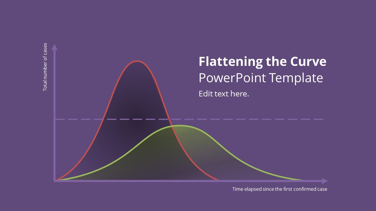
Free COVID-19 Health System Capacity Curve PowerPoint is a free presentation template and slide representing the healthcare system capacity curve. This is one of the most popular curves in 2020 due to WHO declaring Coronavirus a Pandemic. A similar chart like this has crossed frontiers around the world and is very popular in news media nowadays.
How to read this chart? The chart shows that without the protective measures (the tall curve) such as quarantines and social distancing, an epidemic or pandemic could surpass the healthcare system’s capacity to care for patients. However, on the other side, with the protective measures, the hum or curve is flattened. The flattened curve situation allows the healthcare system to handle the epidemic or pandemic properly. One of these measures is the self-isolation, self-quarantine or social distancing.
Using this free curve template for PowerPoint the presenter can clearly present the information on the healthcare system capacity to an audience and explain the importance of quarantines to combat the Coronavirus or any other disease that is declared as an epidemic, outbreak or pandemic.
Slides Preview
Advertisement