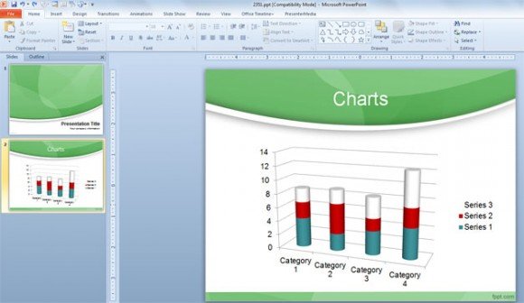
Using Chart Styles to Enhance your Presentations in PowerPoint 2010
PowerPoint 2010 comes with great features to add charts for your presentations. Using the Chart Tools ribbon you can customize your charts and change for example the chart type but also the styles and colors used for the charts. Here we will show you how to use Chart Styles to add styles to your charts easily in PowerPoint 2010.
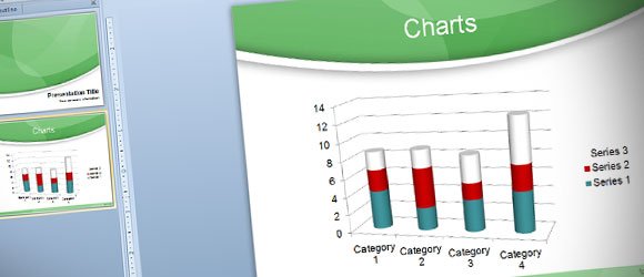
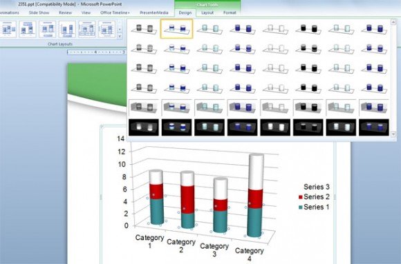
Chart Styles are accessible from Chart Tools -> Design menu. The screenshot below shows you different styles and color combinations for the existing chart. As soon as you pick the desired style your selected chart will be changed. By using this menu you can make your charts look darker or lighter, depending on your current theme, but also change the colors for the chart bar or lines.

If you need to make custom changes to your existing chart, you can also apply custom style changes by entering the Format Data Point.
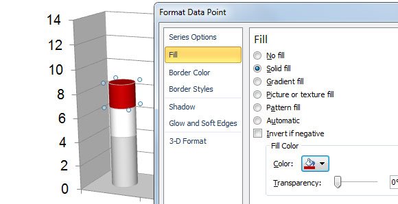
For example, if you want to fill a serie with a different color in a 3D bar chart then you can select the point or element in the chart and right click to enter Format Data Point. Then choose Fill and choose a solid fill. Pick the color using the color picker and set a color transparency if you need to add such kind of style.
Finally, here is a chart example after changing all these chart options.