6 Tactics for Boosting Your Website’s Conversion Rate
Imagine a huge, tall, leafy apple tree without any fruit. No one would dispute its beauty and grace, but still – it is fruitless and almost useless to its owner. Now, imagine the same for your website. Beautiful in design but barren in profitability.
Trees need some care to bring forth fruit and, luckily, the same can be said for websites. Learning the proper ways and all the little tricks on how to boost your website’s conversion rates will bear the fruit of inevitable success.
Speaking of conversion rates, the 2021 averages tell us that if you’re able to convert from 2% to 5% of your website visitors, your strategy has been performing successfully. Of course, the numbers can climb higher; but for now, consider everything above 6% as a bonus.
With that said, you can’t hope for a high-yielding business without a professional-looking website and knowledge in the field of online conversion rates.
There are dozens of ways you can make your website visitors think, “I need this!” and click on “Agree,” “Register,” “Buy,” or “Pay Now.” What follows next is what we consider the six best tactics for boosting your website’s conversion rate.
Showcase Expert Third-Party Testimonials
Reserving a spot on your website for sharing customer testimonials is a tried and true practice. It will nourish the trust of other users and motivate many of them to ask for your products or services.
However, we recommend that you opt for a tactic that’s of a similar caliber as customer testimonials but tends to convert slightly better – expert third-party testimonials.
Can you visualize a greater display to enhance your website than the statement of a person who happens to be an expert in your industry?
What lies behind this tactic is a powerful psychological stimulant.
By sharing the experience and opinions of well-known specialists in your field, you’ll maintain good retention levels, and your visitors won’t feel a need to flock elsewhere looking for important answers. They always appreciate an authoritative figure vouching for the offer they’re interested in.
We know many places where modesty is gold, but don’t be afraid to show off on your website. Feel confident to ask for an endorsement from a prominent client of yours or an external expert with a good reputation.
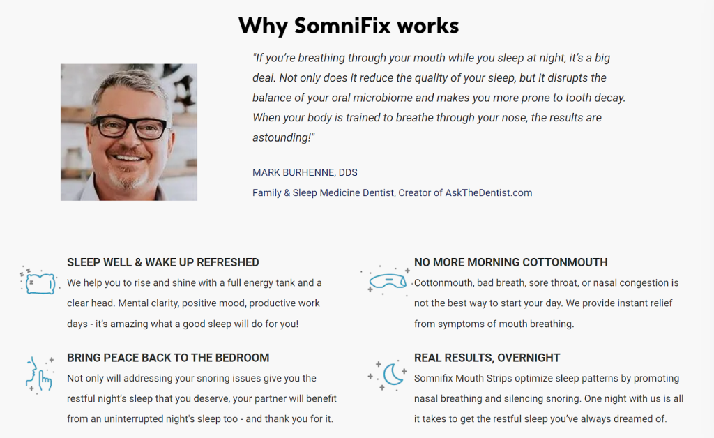
You’ll find a great example of utilizing expert third-party testimonials on the SomniFix homepage. SomniFix is a company that offers gentle mouth strips that promote nose breathing, reduce snoring, and improve sleep quality. The need for their product is reinforced by the statement of an acknowledged dentist who specializes in sleep medicine.
Address Common Customer Concerns
When a salesman tries to sell a product without putting any effort into describing that product in great detail or explaining the terms of the transaction, customers won’t be too happy about making a purchase.
Customers typically have questions such as, “Can the product be returned in case of a mismatch?”, “Is there free delivery?”, or “What payment methods are available?” – but will they actually bother asking?
If you appear to not care about your clients’ needs, they certainly won’t care much about your products. A good way of showing that you care is to address the most likely concerns they’ll have on your website.
Find a good spot on your homepage and add simple explanations for the customers. This is usually done in the form of frequently asked questions and placed near the bottom of a homepage.
It’s a way to help yourself and your visitors erase any worry or doubt over the buying process. This practice also instills important reassurances that you won’t lose a client right before the finish line.
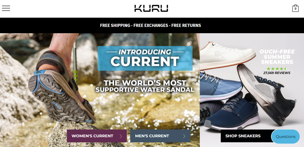
Take a glimpse at the KURU Footwear homepage to see how they address common customer concerns. The company draws their visitors’ attention by telling them important information about the shipping, returns, and exchanges right under the header.
Use Price Anchoring
This is another tactic that you can use to boost conversions on your product pages.
What does price anchoring actually represent? Basically, it’s a pricing strategy where customers are made aware of an initial product price that has been lowered. Buyers will perceive the original price as a reference point and make a decision to buy based on a newly offered, lower price.
Simply said, you can set a price anchor when you strikethrough the initial price ($25.00, for example) and place the new, discounted price of the product which you intend to sell ($19.90, for example).
This will affect the customer’s decision-making process, making them feel good about buying a product that costs $25 for only $19.90. It’s a win-win situation for both the seller and the buyer.
A similar approach would be giving an offer consisting of two or three packages (products) placed next to each other. The product you want to sell the most is tagged with an attractive price compared to the other two.
No matter which strategy you opt for, you’ll need to offer a reasonable discount so that you don’t experience disappointment if your visitors don’t succumb to the temptation.
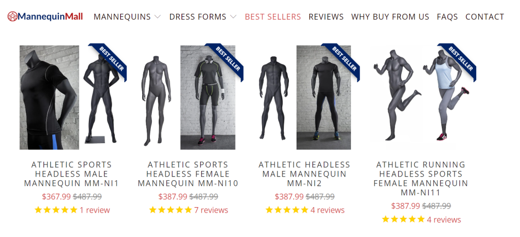
You can witness some clear and effective examples of using this tactic on Mannequin Mall’s product pages.
Use Multiple CTAs Smartly
CTA (Call-To-Action) buttons are an indispensable, vital component of every business’s online presence. They lead customers along the buying process and encourage them to finalize their purchases.
Without CTAs, it would be practically impossible for businesses to seal the deal with potential clients.
Multiple CTAs, placed on strategically chosen spots, increase the chances for a click while random visitors scroll up and down your website.
Acting as a link between simply accessing the content on your website and successful conversion, CTAs need to be carefully designed so that the conversion chain doesn’t break.
Effective CTAs that will stand out in the whole picture are those that are simple and eye-catching at the same time. The wording of your call to action is also vital, so try to use straightforward, short, and enticing messages. A tiny dose of creativity or humor won’t hurt as well.
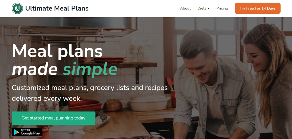
You can find the Ultimate Meal Plans website useful in this regard. Their entire homepage concept is expertly put together so that their multiple CTAs clearly pop out and look fantastic.
Generate Urgency
When put under a tolerable amount of pressure, the human brain tends to use its full capacity and process information faster. It’s good to know this fact as you develop a strategy for improving your website’s conversion rates.
When seeing signs that indicate urgency, customers tend to make faster purchasing decisions. As long as these signs suggest urgency that is strong but not strong enough to confuse and discourage the buyer, you’re heading in the right direction.
A good practice for generating urgency that you can use is to offer temporary deals such as “This offer expires soon!” or set a timer that will indicate for how long the offer is available. This will encourage customers to feel excited and compel them to take action faster.
Another approach in this regard is to make a notice of experiencing high demand and limited availability at the same time. Phrases such as “Only 2 items left!” and “37 people show interest in this product,” for example, can definitely urge customers to convert.
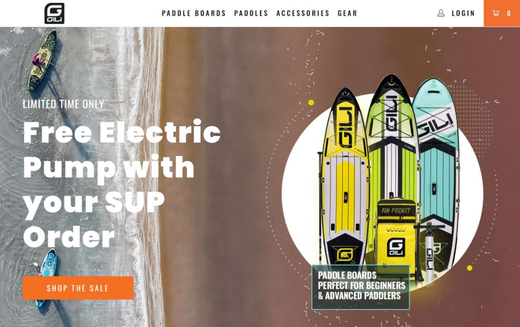
GILI Sports, a company that sells paddle boards and accessories, uses a subtle tactic to tell visitors that their offer for a free e-pump for every SUP order lasts for a “limited time only.” Take a look at how they achieve this:
Simplify the Checkout Process
As the buying process is about to be completed, the final steps must be as simple as possible.
Simplifying the checkout process will help the buyer proceed all the way to the end, feeling confident that they’re making the right choice by doing business with you.
Make sure that your checkout process involves only the absolutely necessary steps, and avoid long forms and mandatory registration.
When you’re creating the checkout page, cut out all excess elements that will distract and discourage buyers. Include only the vital elements such as:
- checkout details
- delivery details
- payment details
- confirmation
When it comes to giving too much personal information related to bank accounts and privacy details, people can become insecure and quit at the final stage, right before they confirm the purchase. Therefore, don’t make them click “cancel” because of too many checkout steps and unnecessary data.
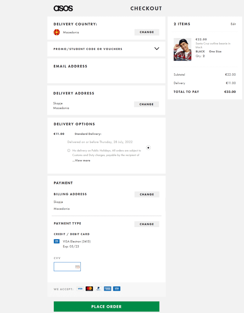
You can find a good example of a great checkout process on the ASOS website. It’s simple, super-quick, and features only the vital elements.
Final Thoughts
Behind the scenes of the entire psychological aspect of encouraging a visitor to convert and become a loyal customer, there’s extensive, experimental research that entire marketing teams dedicate their time to develop and refine.
This article summarizes the most effective methods to increase website conversion rates used by successful, high-performing online businesses.
By implementing all or even some of them, you’ll get closer to those high conversion rates you’re after.