Spider Gap Analysis in PowerPoint
Last updated on September 13th, 2023
In this tutorial you will learn to make a gap analysis chart. This kind of chart is also known as a spider gap chart, spider chart, and by the name used in PowerPoint—radar chart. The gap analysis chart is great for showing the current and target strengths of something (a company, team, etc.), priorities by majority vote, and other things. In this tutorial we’ll just focus on current and target strengths.
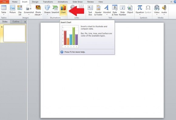
First, go to the Insert tab and click on Chart.
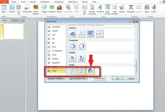
Once Chart is opened, go down to Radar. Either of these would work for this first example, but we’ll use Shaded Radar. We can easily change it later and it will be changed to show the different types. You can learn more about radar charts in PowerPoint in How to Insert a Radar Chart in PowerPoint.
If you already have the data you want represented in the spider chart, please enter it in Excel—which opens whenever you insert a chart into PowerPoint and is linked to your chart.
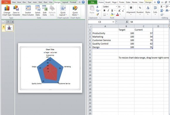
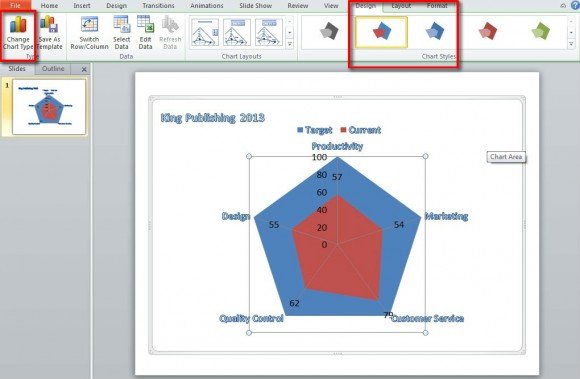
In the case of a shaded radar chart, it’s best to put the target (or whatever goal you wish to use) and the current second. This means target in the B column and current in C column. The end target for any type of growth is usually 100 even though you may say “We are currently at about 40, we wish to double this by the end of 2027” or whatever your goal might be.
The reason for putting the two options in this order is show that current will show on top in the shaded radar chart. This won’t matter with the other two gap analysis chart types. After you have inserted the data you’ve compiled into Excel your chart is done. All that is left is for you to design/stylize it however you wish.
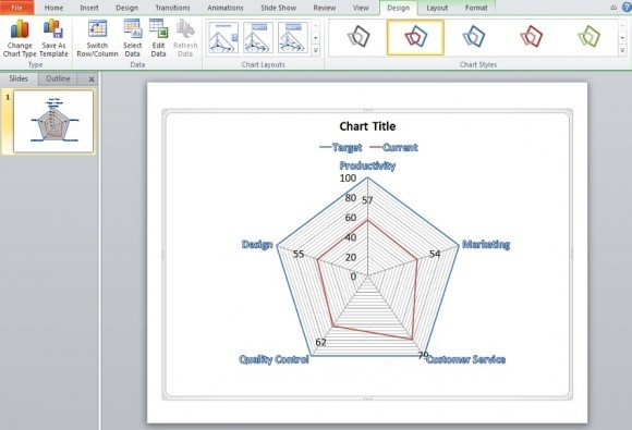
Next we want to change the Chart Type. Click on the spider gap chart so that Chart Tools appears once again at the top of the screen. There will be a green tint over the Design, Layout, and Format tabs. Now click on Design.
Navigate over to Change Chart Type, go down to Radar, and select one of the two not Shaded Radar. Here we selected the regular radar type.
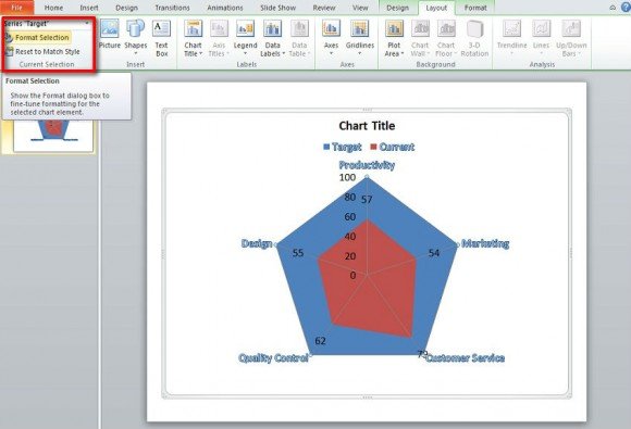
Going to Chart Layouts on the same row will allow for you to change the appearance of the spider chart, mainly how many lines are displayed here. With the shaded radar chart, if you wish to display the overall chart and have current shaded, select Layout.
Go to the upper left of the window just below File. Next choose Target in the drop down and click Format Selection.
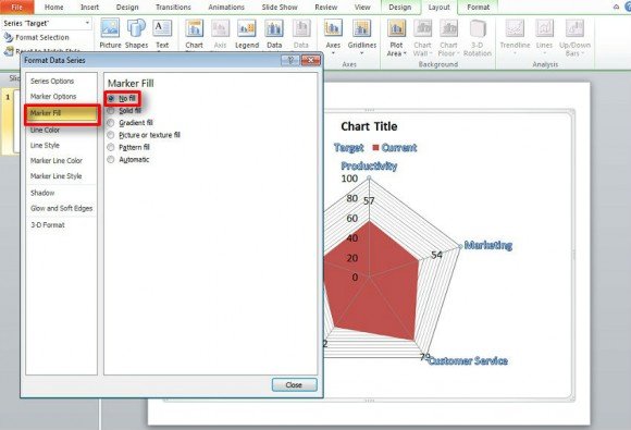
Next, just go to Marker Fill and select none. Now the rest of the spider chart is shown and just the current data is shown to be shaded.
As is the case with all charts you will make in PowerPoint, it is best to have your data ready for Excel. See our tutorial on Preparing Data For Bar Graphs. The same basic approach applies for all charts in PowerPoint: observe the chart and insert data in Excel accordingly. If you want to learn how to make a Gap analysis, you can refer to our ultimate guide on Gap Analysis, or download some animated Gap Analysis PowerPoint templates.