PowerPoint Charts At A Glance
PowerPoint Charts can be created with any Microsoft PowerPoint release. However, the latest versions of Microsoft PowerPoint comes with enhanced charts and options that helps us create engaging PowerPoint charts for our presentations.
When you create a new slide with PowerPoint, the center text box will display small icons that allows you to access different features. One of these features is the PowerPoint charts.
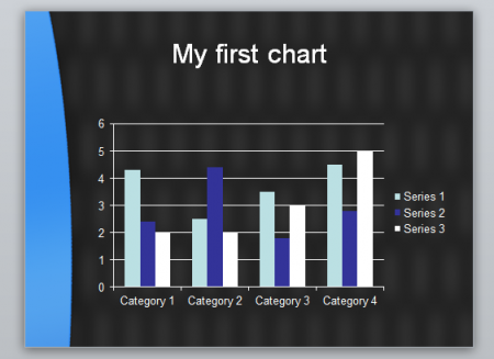
We have created simple chart images in PowerPoint using the blue Management PowerPoint template that we downloaded from free-power-point-templates.com site. Please see examples below.
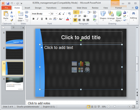
Click on the colored chart icon at the center of the slide and a chart dialog box should appear.
Once you chose your PowerPoint chart type, you’d be asked to enter some data in an Excel spreadsheet. This is a new feature on the latest version of PowerPoint that allows you to create great chart calculations instead of copying your charts from other applications, including Microsoft Excel, Photoshop, Datawatch Monarch Pro or other advanced reporting tools used by IT departments and accountants.
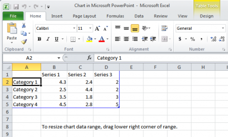
In the Excel spreadsheet, you can use the cells to enter chart series and values. This is the preferred way to enter a chart in PowerPoint. You can save your data and modify it later when necessary.
Related: Bubble Graph in PowerPoint 2010
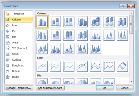
There are many possible chart types with PowerPoint. The recent versions include:
- Columns PowerPoint charts
- Axis PowerPoint Chart
- Pie Charts in PowerPoint
- Bar Charts in PowerPoint
- Area Chart in PowerPoint
- X Y Scatter Charts
- Stock Charts
- Radar Chart in PowerPoint
- Bubble Charts in PowerPoint
Each chart type has different visual representations. Depending on how you want to display your data and your type of audience, you can choose between different chart options, including the PowerPoint 3D Charts.
When you have chosen a particular chart, it will appear as slide content. Modify your data and the spreadsheet and choose the Chart options. You can use the 3D Chart or change the chart colors in PowerPoint.