How to Present Data in PowerPoint
Last updated on April 16th, 2024
When it comes to presentations, Microsoft PowerPoint is a powerful tool which not only aids you in getting your message across to your audience but can also become a strong visual aid which can help you and your audience. But most people don’t know about the many exciting features that you can add to your presentation.
Presenting data in PowerPoint is an art and your job here is to make your slides in a clear fashion so as to get the point across to people. If your slides carry an unclear message then it is as good as wasting your time. So all the tables, graphs, charts in your presentation should be clear and should not confuse or distract people from the message you want to convey.
Presenting data effectively in PowerPoint is a craft that requires precision and strategy. Your primary goal should be to communicate your message clearly and concisely. If your slides are cluttered or the data is presented ambiguously, the core message may be lost, rendering your efforts ineffective. Ensuring that every table, graph, and chart enhances understanding without distracting from your main points is crucial. This is known as the The Art of Presenting Data.
Making the right use of statistical data in a presentation is an acquired talent and a soft skill. And the first step is to make sure that you present the information in a clear and concise manner.
Choosing the Right Data Representation
Selecting the appropriate format to display your data is essential. For instance, line graphs are ideal for showing trends over time, such as the average increase or decrease in the price of a commodity.
On the other hand, pie charts are better suited for displaying proportions, such as market share distributions among different commodities.
Expert Tip: Dr. Linda Shapiro, a data visualization expert, suggests:
When selecting a chart type, consider what you need your audience to understand immediately. A well-chosen graph can replace thousands of words.
Dr. Linda Shapiro
Depending on what information you want to present, you should make use of charts, tables or graphs.
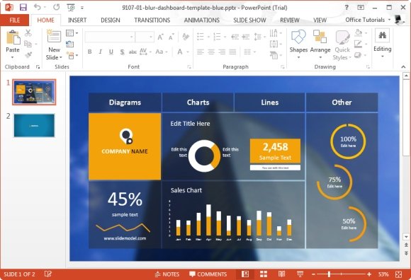
- Type of Statistical Data: It is very important to choose the right kind of representation to present your data. Say, if you have to show the average increase or decrease in the price of a commodity, then it’s best to use a graph to represent that! Or if you have to show the average market share of different commodities, then you can use a pie chart! The goal here is to make your audience understand the data the same way as you understand it. You can use PowerPoint Dashboard Templates (like the one shown above) to make your data easy for the audience to grasp.
- Representing Data with Color: Color coding your statistical data can help get your message across to your audience with ease. The chief motive of using statistical data is to make your audience understand using representative figures. Imagine how hard it would be if you had to explain a graph in words! Using color helps in differentiating one thing from another! Say if you want to specifically point one commodity from a graph, then you can mark it with a different color so that it can catch the attention of your audience.
So using the above two methods you can make an amazing presentation and get your message across to your audience clearly and with ease.
Alternatively, you can browse our data presentation templates or learn more about the best data chart templates for PowerPoint.
Using PowerPoint Dashboard Templates
To facilitate understanding, consider using PowerPoint Dashboard Templates. These dashboard templates are designed to present complex data in an easily digestible format, allowing audiences to grasp key insights at a glance.
Effective Use of Color in Data Presentation
Color coding is an invaluable tool in data representation. It can direct attention, highlight important data points, and differentiate elements within a chart. When used correctly, colors can significantly enhance the interpretability of your data.
Jonathan Schwabish, author and the man behind PolicyViz, in his book Better Data Visualizations explains that he recommends start designing the charts with only one gray color, and then highlight the important data with a second color.
Accessibility Consideration: Ensure that the colors used are distinguishable for all viewers, including those with color vision deficiencies. Tools like the Color Universal Design (CUD) utility can help select an accessible palette.
Integrating Advanced Features
PowerPoint’s advanced features, such as animation and interactive elements, can also enhance the presentation of data. For example, introducing animation can help illustrate changes in data over time or focus the audience’s attention on specific points during your presentation.
Learning and Resources
For those looking to delve deeper into presenting data in an effective way with an effective design, numerous resources are available:
Microsoft’s own tutorials on PowerPoint offer a comprehensive guide to mastering its features.
Online courses in data visualization and presentation skills can provide more structured learning paths.
Books on data visualization techniques offer a good starting point to understand why data matters and how to present it to achieve your presentation goals. Better Data Visualizations by Jonathan Schwabish is a good example of a guide for Scholars, Researchers and Business.
Downloadable data chart templates can offer a starting point that you can customize to suit your specific needs.
Conclusion
When delivering a presentation, the clarity and impact of your visual aids can make a significant difference. Microsoft PowerPoint offers a suite of features that not only enhance your ability to communicate effectively but also help engage and educate your audience. However, many users are unaware of the advanced functionalities that can transform their presentations into powerful tools for visualization. Effective data presentation is about more than just displaying numbers or presenting your data; it’s about telling a story that resonates with your audience. By utilizing the right tools and techniques in PowerPoint, you can transform dry figures into compelling narratives that inform, persuade, and engage.