How to create a scatter plot in PowerPoint
Scatter plots are a type of graph which is used to show the trending of some sort of data and showing how large is the variance of the system. This type of presentations come handy when you need to show your customers how good (or bad) is the trend for any sort of topic: assays, experiments, revenues, sales, etc. The chart is widely used in bioinformatic field but also in statistics.
Today we are going to show you how to create a scatter plot in Powerpoint.
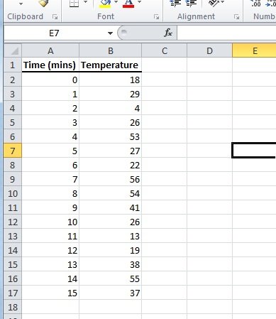
Step 1. Create an Excel Worksheet using Microsoft Office Excel and write down the data you are going to show in a tabular format.
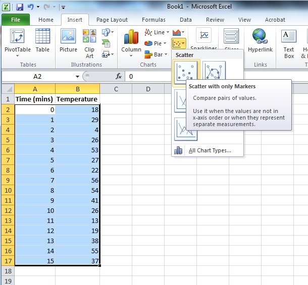
Step 2. Using the Insert menu create Scatter Plot (whichever you prefer).
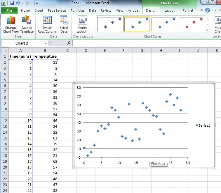
Step 3. Personalize the graph as you want, give colors, set titles and then you just need to cut it and paste it on your Powerpoint presentation.
That’s all. But you can also do it in a different way, just go to PowerPoint and then click on Insert -> Chart and a new Excel spreadsheet will appear. Here you can reproduce the same steps above.