Create Awesome Visualizations For PowerPoint Using Many Eyes By IBM (Free)
Many Eyes is an experimental service by IBM for creating data visualization charts. It provides users with the utility to upload their custom data sets for creating visual charts that can be embedded or shared via social media. For example, you can create a visualization chart for say a demographic survey which can be shared across the internet. The Many Eyes Service is currently a preview edition which has not been completely tested and is available for free. You can submit your visualizations to Many Eyes after creating your free account, provided the content is non-confidential.
Many Eyes is somewhat like the devaintART service which is widely used by users to share images created by individual artists. Many Eyes provides a similar platform for creating dynamic visualizations which can be rated, discussed and shared by users. The created visualizations can even be later embedded to a presentation (e.g. PowerPoint presentation). To learn how to add webpages to PowerPoint, see our post: How To Insert a Webpage in MS PowerPoint.
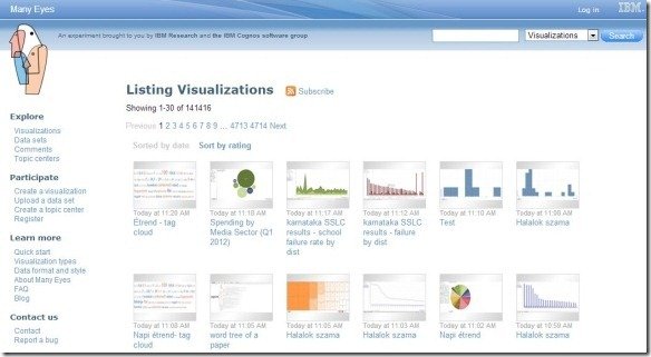
While you can explore submissions by other users without an account, you will require signing up for a free account to upload or create your own visualizations. Once logged in, you can explore Topic Centers, take part in discussions, rate and leave comments on visualization charts submitted by other users and of course, submit your own data visualization charts to contribute to the Many Eyes project.
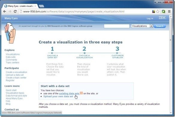
To create a visualization, go to the Create a Visualization option from your Dashboard. From here you can either upload your own data set or pick an existing data set to customize. You can easily create your own data sets in Microsoft ExcelTM or a Text file and see instructions by clicking on Upload your own data set option.
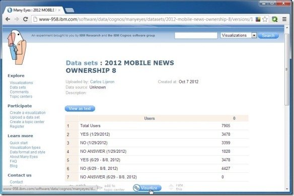
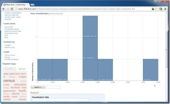
If you select an existing data set you can customize it to suit your needs and choose a preferred visualization style such as a Word Tree, Tag Cloud, Bar Chart, Word Histogram, Matrix Chart, Word Cloud Generator, Work Histogram, Scatterplot, Network Diagram, Treemap, Treemap for Comparisons, World Map, Stack Graph, etc.
After your chart is complete you can enter a title, tag, description and Publish it online.
Published charts can be shared via sharing link, Embedd code,Facebook, Twitter or via Email.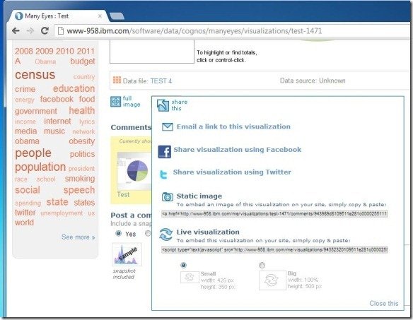
For more information about the creation of data visualization charts and to explore submissions by users from around the world, head over to the Many Eyes website.
Go to ManyEyes By IBM
One comment on “Create Awesome Visualizations For PowerPoint Using Many Eyes By IBM (Free)”
Comments are closed.