How to Combine Different Chart Types in PowerPoint
Last updated on December 26th, 2023
Charts can be handy in presentations where you need to show data. This is sometimes preferred against complex tables as a visualization tool because the audience can get a better view of what you want to show. However, the charts should be prepared according to your presentation to make them readable.
PowerPoint charts are very powerful and you can customize these charts a lot. For example, some people in business or social research may need to combine different chart types in the same chart, just to differentiate the series.
We can combine different charts in PowerPoint easily using the chart functionality. First, we are going to create a basic chart in PowerPoint.
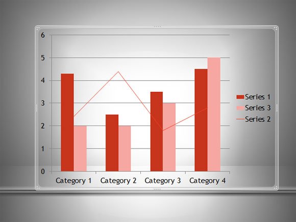
Let’s say we start creating a columns bar chart in PowerPoint. We can define three series and then we can change the chart type for one of these series.
In order to do this, we need to right click on any series column and you will see this option.
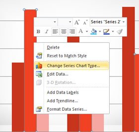
When you click on Change Series Chart Type a new dialog to choose the chart type will open. Here you can choose a chart type for the selected series only.
In the example below we are showing how to use a line chart type for the Serie #2. You can download free charts and diagrams for PowerPoint from this website and learn how to make awesome diagrams for your presentations.
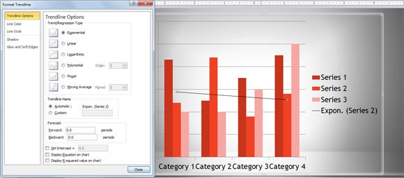
Lastly, but not least important, sometimes we don’t need to change the chart type for the series. Instead, we may be interested to add a trending line for the whole chart. This can also be done with Add Trendline option in PowerPoint.
Adding a trendline is a good way to show trends in PowerPoint charts. Once you click on this option, you can see the Format Trendline dialog box where you can choose different trending lines option, for example Trends and Regression type, Exponential, Line, Logarithmic, Polynomial, Power, Moving Average, etc. You can also use this to forecast the data and display the R-Squared value on chart as well as the resulting equation on chart.
In this article, we explained how to combine different chart types in PowerPoint. If you need to merge different presentations into a single one, we recommend reading our article on how to combine PPT presentations in PowerPoint.